


Flags are a way for communities to display their collective pride and patriotism. Currently, Dunedin does not have a cohesive identity. As the story goes with university towns, every three years there is a whole new batch of students, and therefore a whole new identity. A flag would give students something to feel proud of and be represented by (more than just hall hoodies and ugly uni merch). A true beacon of breathas, a symbol of Scarfies, a design of dropkicks. This flag could give your landlords the motivation to install a flagpole outside your damp, cold, rat-infested flat. So we took some guidance from the NZ government circa 2016 and opened the entries to our student body.
Prompted to create a flag that is uniquely Dunedin, we received an influx of entries, which were then judged based on three criteria: 1) How representative of Dunedin is it? 2) How unique and creative is it? Think laser kiwi levels of creativity. Lord knows that if we were old enough to have voted for it, that would be the flag we fly. And finally 3) Is it a little bit fucked up? Get those boring, bland, and uninspired flags out of here; this is Critic after all. We wanted to see iconography of the debauchery and delinquency you don't want your family to know you get up to in Dunners.
Here is what our expert judges had to say about some of the entries:
Third Place: Bleeding Blue & Gold
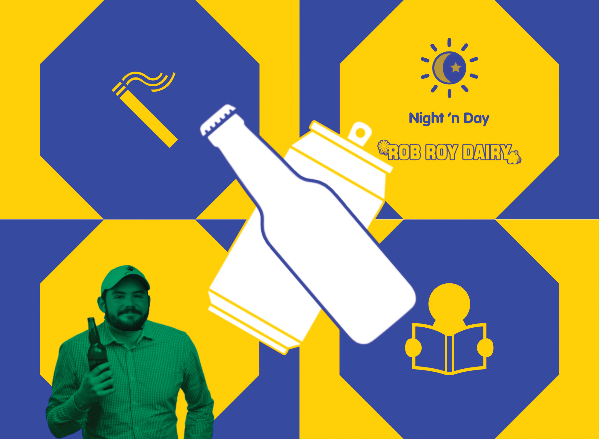
With bright colours, shining Blue and Gold, this entry is a great representation of a Dunedin filled with liquids, cigarettes, and criss-cross fries. The inclusion of the Night’n’Day and Rob Roy logos shows real Dunedinite knowledge. OUSA Prez Liam White’s image does make this flag pretty timely; however, our panel does worry that it means that the flag won't be a true representation in years to come. The artist did explain to the panel that this entry is inclusive for the part of the student body that doesn't drink alcohol, since the cans could be fizzy drinks. Overall, this flag was let down by the lack of depth – it feels removed and like someone in Auckland could have made it, if armed with a cold Speight’s and a copy of Critic Te Ārohi.
Overall score: 21/30
Second Place: Patchwork Flag
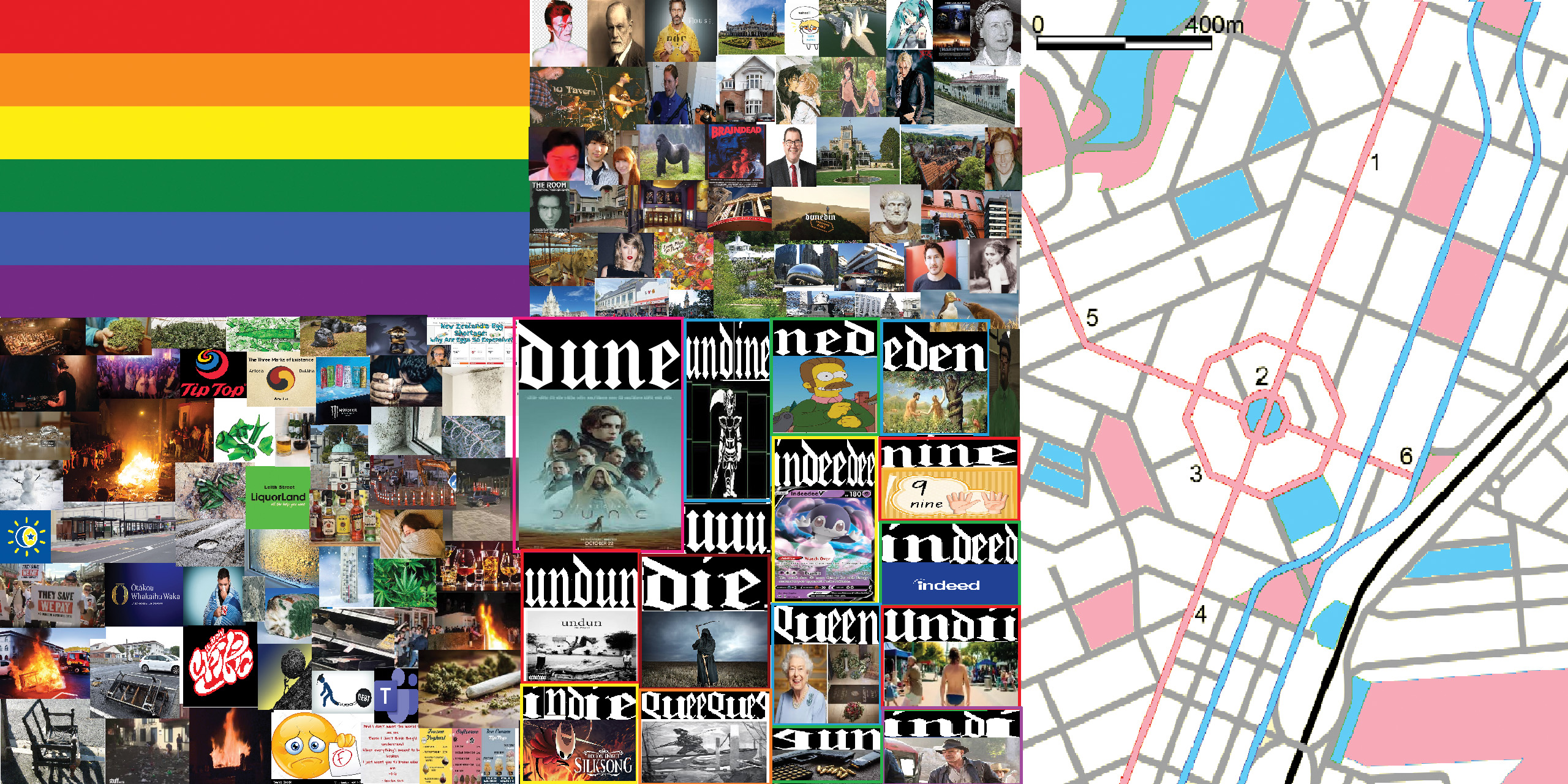
Visual complexity at its finest, with many nuanced perspectives of ‘the Dunedin experience’, including, but not limited to, failing papers, smoking joints, and road cones. This design, with the vast LGBTQIA+ representation through a flag and queer icons David Bowie and Grant Robertson, is by far the most inclusive entry. The pop culture references also bring it into modern times, such as Harambe mentioned in the top middle quadrant of the flag and Taylor Swift (new era soon!). With a touch of refinement, this flag could have been the winner, but its visually complex design does undermine the usual simplicity of a flag.
Overall score: 24/30
First Place: Flag of Ds
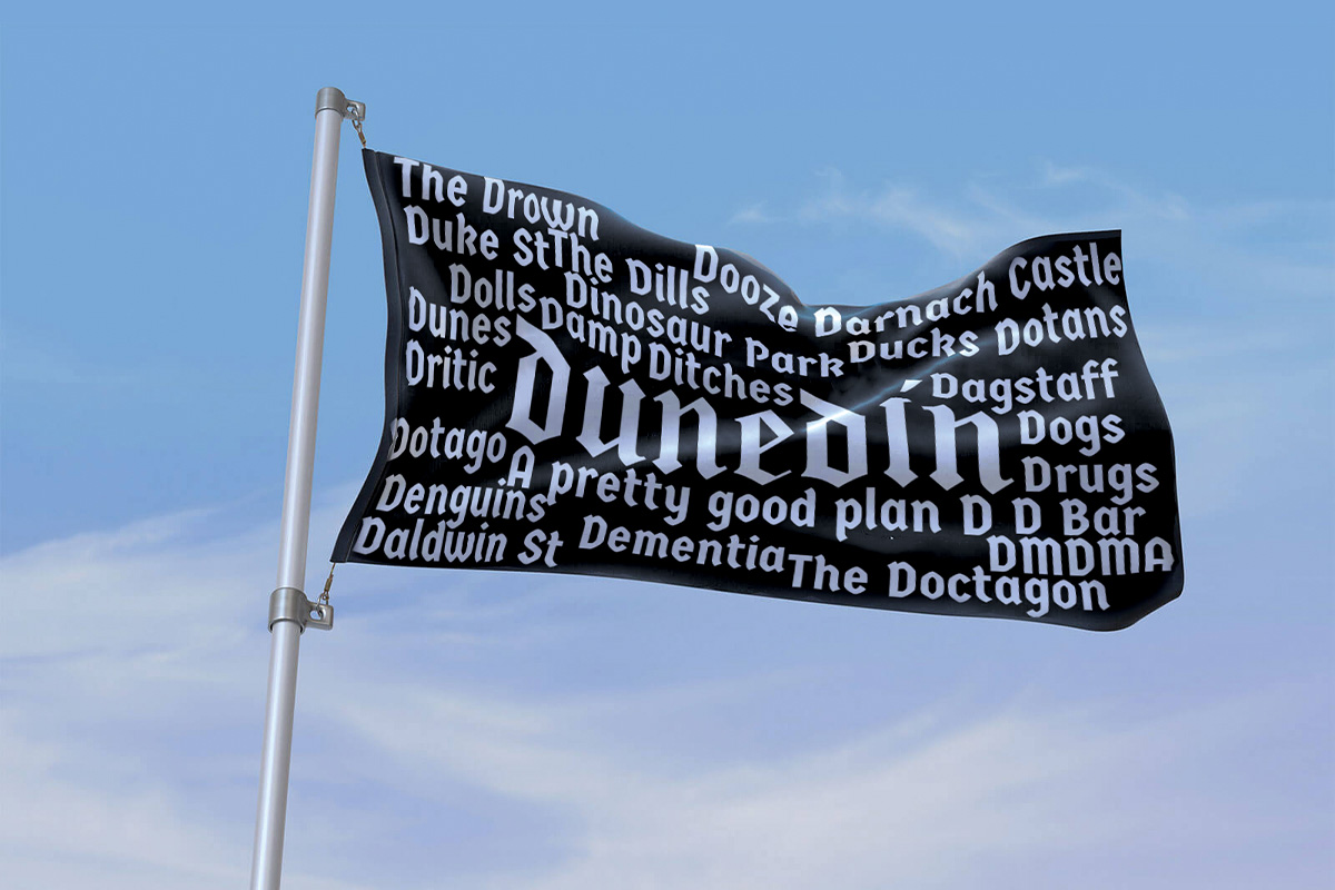
D-D-D-DAMN! Getting more D than the Capping Show cast (allegedly), this is quite the hot contender. While it leaves very little to the imagination and is VERY literal, it gets the point across pretty clearly. Our esteemed artist clearly has had a pretty well-rounded experience in Dunedin and has even given the city a wee tag line: “Dunedin – A pretty good plan D”. Well put, sir. Unfortunately, this flag missed one pretty obvious D of Dunedin: DNB. Our judging panel did appreciate the inclusion of two of our favourite things, though (the Dinosaur park and DMDMA, which pair well together).
Overall score: 26/30
Honourable Mentions
Dragon flag
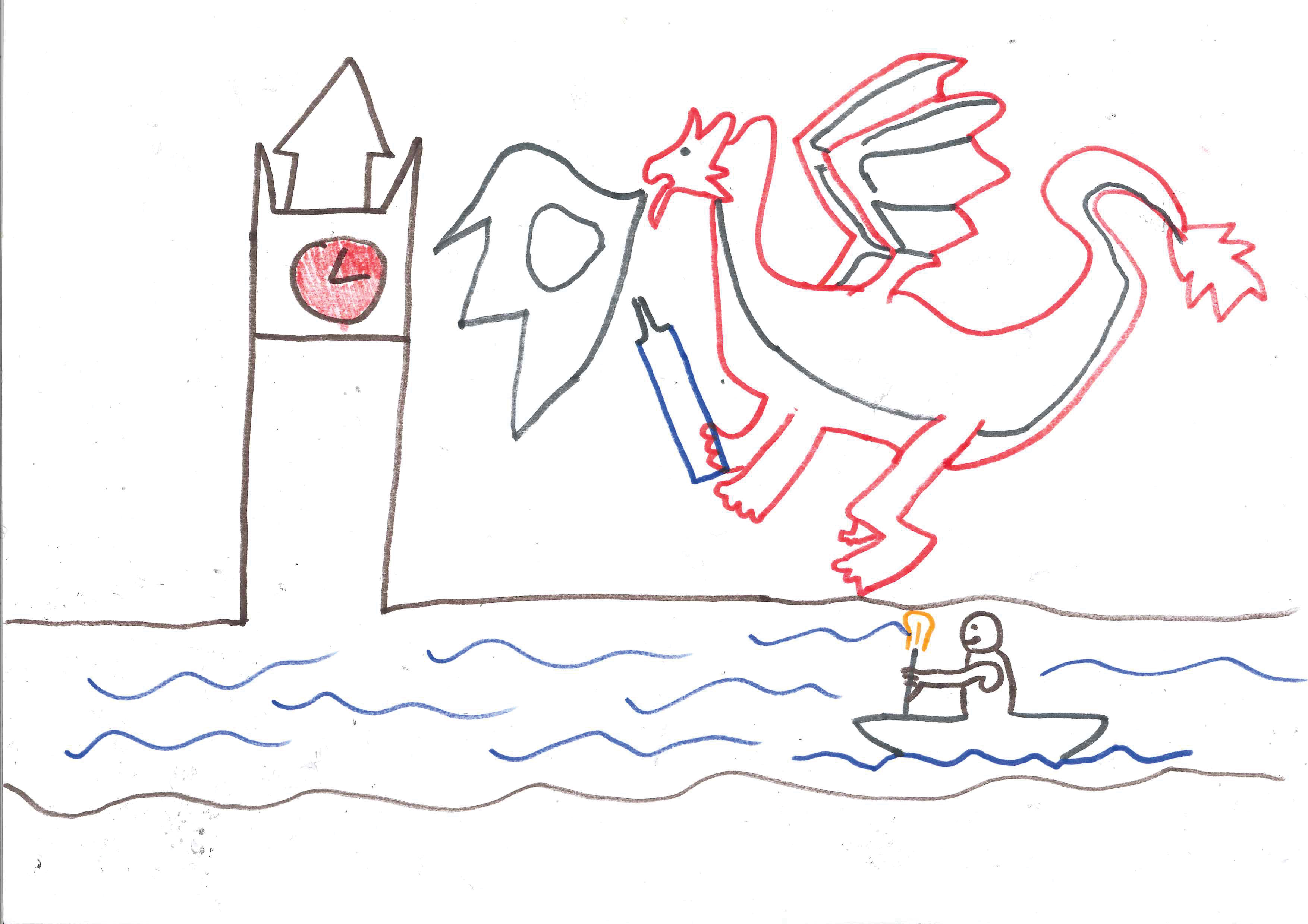
The bare bones of being a cool flag are there. However, the artist clearly does not possess the skill to truly get their vision across as cleanly as one might hope. With a bit of work from someone such as Evie Noad (our head designer), this work may have been a real contender. However, as it stands, this artist may have taken the “a bit fucked up criteria” and run with it too much. The judges can’t help but wonder if it was really drawn by a child wearing beer goggles. Unfortunately, it appears to have been a skill issue that shackled this dragon.
Saudunedin
Okay, this one tripped us up a little bit. With an uncanny resemblance to the flag of Saudi Arabia, it made the judging panel question the similarities between the country and this wee city of Ōtepoti. A quick Google showed us not much, at a push both host large gatherings for a shared cultural experience (Mecca and O-Week) – that’s kind of all we’ve got. While clean and green, this flag did leave a bit to be desired. As a straight rip-off of another nation's flag, it sadly fell flat in the creativity sector (read: plagiarism).
Beers, Beers, Beers
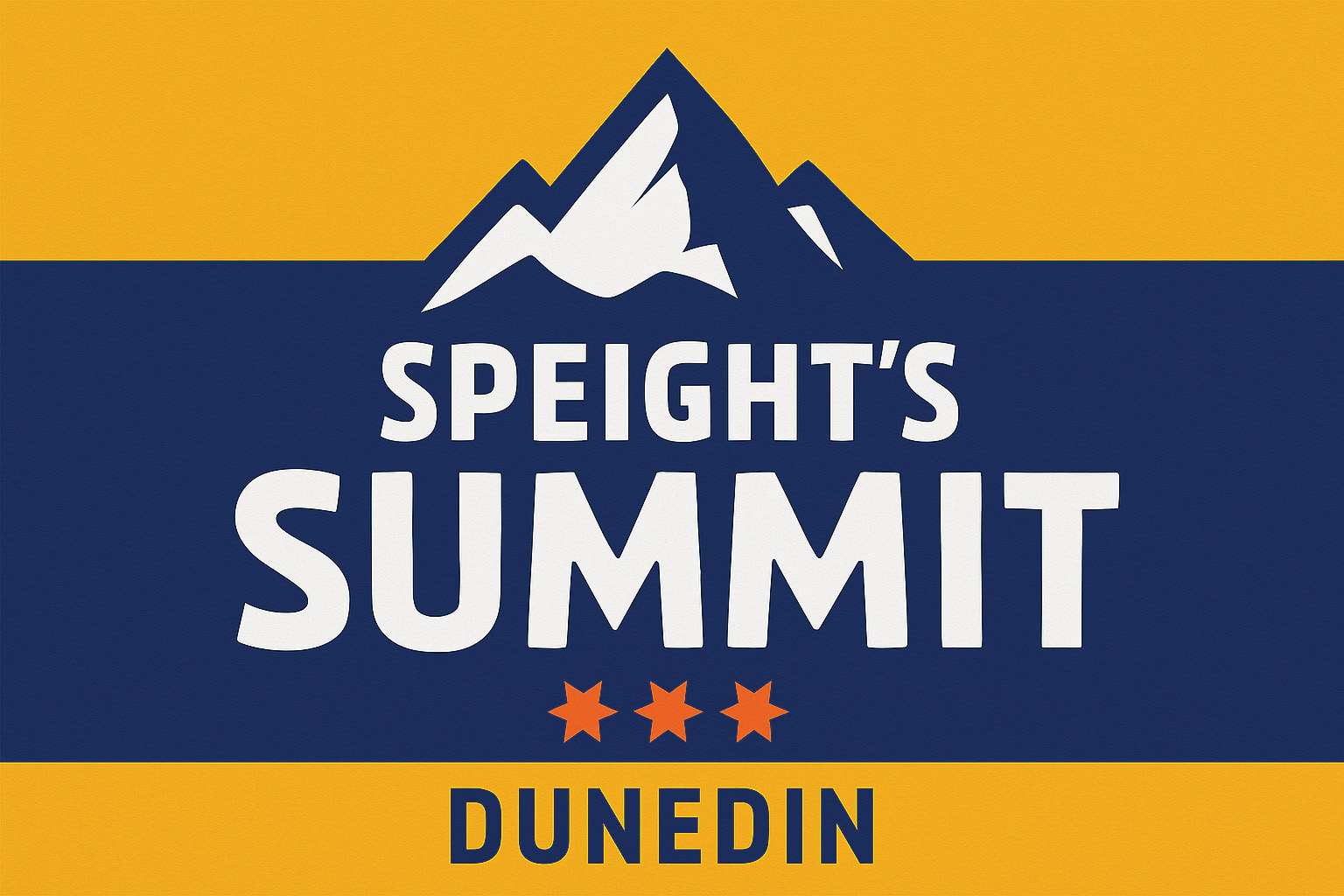
This flag, while classically representative of Otago, through its use of the Gold and Blue colours, lacks a certain je ne sais quoi. We do worry that this design perpetuates the idea that all we do in Dunedin is smash back beers and go to Highlanders games, but we are more than that. The use of the Speight’s Summit logo is definitely showing some pride of the south; however, the judging panel was informed that the design was created by ChatGPT, and as people with some sense of morals, we cannot allow it to hit our rankings.
Palestinian flag
Submitted as a statement of solidarity with Palestinians, this entry calls on OUSA to demonstrate a commitment to the student body's values. The submitter notes, “By flying the flag of Palestine, a symbol of resistance for all those who persist under the boot of colonialism, white supremacy, imperialism and capitalism, we condemn the terrorist state of Israel for its crimes against humanity.” With the recent BDS posture decision, flying this flag would cost pittance in comparison to the $500k figure cited in the decision.