


Untitled by Dave’s Flat
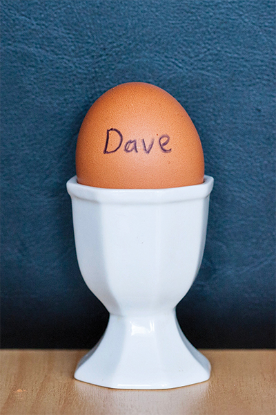
Dave’s Flat are the elusive artist behind last week’s centrefold in Critic. Like Banksy, they do not want their identity to be widely known. The work is as mysterious as its creators; an egg in an eggcup, with the word ‘Dave’ written across the egg in black vivid.
The artists flat together, but they do not flat with someone called Dave. “The egg’s name is Dave,” the anonymous collective of artists revealed.
As well as the photo, the flat also have the actual egg itself, which is now six months old. He’s sitting on a windowsill somewhere in their flat. “He hasn’t exploded yet, so that’s a good start,” said one of the flatmates. However, they are careful to emphasise that while “Dave the egg is important, Dave the portrait is more.”
Their creative process was profound from the beginning. “What we really wanted, we wanted something to hang on the wall,” they said. The boys said they looked to modern art references and realised that no one had done an egg in a cup. “Why don’t we be the first?” they wondered.
“We wanted something that didn’t have much meaning and gradually took on meaning over time. We just randomly thought; an egg, how is it going to gain some meaning? We wrote Dave on it to give it some personality,” they said. They made Dave on the very first day of O Week, when they decided their walls looked a bit bland.
The photoshoot itself took about “two hours” they said, with one flatmate lying on the floor while taking a picture with a tripod. No one can deny that they produced a relatively clean photo of an egg in an eggcup. They even put the photo through some photo editing software, because they wanted it to be “lined up in the middle”.
The next step, obviously, was going to Warehouse Stationery in South D with a pen drive and making the very confused lady at the print shop ink an A2 print of their untitled artwork. It was a “fairly awkward process” apparently. “She asked us a few times if we really wanted this photo, made sure we were aware that it was going to cost upwards of $20.”
Now it hangs in their lounge, A2-sized (i.e. huge) and framed. It’s proven to be a provocative piece. “We’ve had arguments with people in the past, like how valuable is Dave? Is this real art? so to have it recognised [in Critic] is a big moment,” the artists said. Someone has even tried to steal Dave from their wall.
“We feel somewhat vindicated that other people have Dave on their walls now,” they said.
Ornamental Anatomy by Rozyczka Schimanski
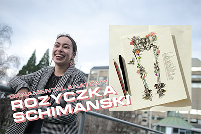
Rozyczka Schimanski is a med student, which helps to explain why her drawings are so anatomically correct. Her piece, Ornamental Anatomy, won second prize in the illustration category at Art Week.
“I’ve been to Art Week for a few years now and really enjoyed looking at the art, but I’ve never quite had the confidence to enter before,” she said. “My friend pushed me to enter this year.” And now she’s won a prize. She describes her process for making art as “chaotic”, but said “a cup of tea always helps.” “I’m extremely erratic and really have to be in the right place to make art.”
Deciding to make her art public has not been entirely chill. “It’s slightly freaky to know people will have walked past and seen your art. I haven’t put any of my art in a public space before, so that’s new to me” she said. She describes having “imposter syndrome, not thinking that something I’ve done is good enough” in both art and med.
For her, art is a hobby. She reckons art helps her to have balance and “take a break from the mountain of a workload that is med or any other degree, that’s helpful.” But she also thinks that “having a creative way to solidify that medical knowledge” is useful too. “It’s definitely useful for muscular-skeleto case studies”, she said, as if that is something I understand.
Ornamental Anatomy was a piece that she started “in lockdown, during one of my tutorials”, she said. It wasn’t an anatomy class, but a class about doctor patient relationships. Roz describes one of her main influences as historical anatomy drawings.
“I’m starting to get into illustration and I’ve especially been interested in medical illustration lately” she said. She said she’s been “inspired by historical medical illustration collections at the University.”
“There is a tonne of really beautiful work”, she said. “Compared to the anatomical textbooks we have today, which you can get at bookstores, they’re generally quite to the point and digitally illustrated. They’re still beautiful. But these historic ones are different.”
She describes one book in particular, which is a pop-up book showing all the different layers of the body. But the illustrator didn’t stop there. Instead of just showing the human anatomy, they also weave in symbols and meanings that make the drawing really beautiful and artistic, as opposed to just being used for scientific reference.
“Quite often they would have religious symbolism or other elements that were responsive to the social climate at the time” Roz said. “I find it interesting how that goes along with the scientific aspect of things.” That’s something she brings to her own art, creating scientifically accurate drawings that are creative.
Roz didn’t have an art Instagram until I asked “do you have an Insta to plug?”
“I just whipped one up lol”, she said. You can find her on Instagram at @rozschimanski_art.
Breather Jesus by Sasha Curin
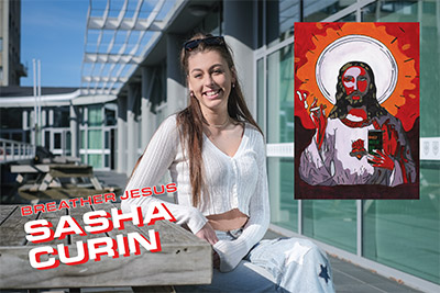
Sasha Curin is new to art but she has managed to capture the spirit of Dunedin in one image. Breather Jesus should be the DCC’s next mural, and it should be on the side of the Dunedin Cathedral.
“I took up painting in lockdown”, she said, because of the “boredom”. She’d been drawing for a while, but decided to try painting instead. She ended up painting for about two weeks straight, mainly doing clothes for herself to wear. Then Breather Jesus “came to her in a vision”, she said. “It was a random idea, I had a vision of painting a religious figure and I thought what would stand out to students? What does student culture idolise? And it’s a Billy Mav and a cigarette.”
After she was struck by the idea, she started doing some research. “I was on Pinterest and I saw lots of works of Jesus, then I changed that to a more illustrative style. It worked perfectly with him holding a can and a cigarette.” She didn’t want to replicate something entirely, she said, instead preferring to put her own “twist” on the reference pieces she looked up.
When she first made Breather Jesus during lockdown, she wasn’t intending to sell it or exhibit it. “I thought it would be funny for my flatmates to put up on the wall, then people started coming around and saying I should make prints of it.”
Dunedin student culture features prominently in the work, and Sasha reckons that has helped her. “Especially the boys, they’re like ‘that’s sick’. So it was related to students in Dunedin, I feel, that’s why I like it.”
“For art to be appreciated down here, in flats, it has to be funny or relatable to students. They don’t want a watercolour of the ocean”, she said. “They want something fun to put up on the flat wall, where it can be a conversational piece. Something they can understand and get. That’s what I feel like the art culture is about here in Dunedin.”
Breather Jesus turned out to be the first piece in a series. “I call it the Oxymoron Series” Sasha said. “They’re not controversial but they mash together two different things, the good and the bad figure.” Other artworks in the piece are Medusa Mary, like the Virgin Mary but with her hair as snakes, and then Assassin Cupid, which is Cupid flying with an AK-47. The series has been a “real recent thing”, Sasha said. “I want to do more but those are the first three ones.”
The focus of this series is taking iconic figures and changing something about them. That’s something Sasha is not done exploring. Her next focus is the Statue of Liberty. “I like playing with the idolised figures and renaissance stuff”, she said.
She described herself as a “sporadic” artist. “I wait for ideas to come to me. I get in painting moods, then I won’t touch it for ages.” She reckoned that Art Week has been a great way to get her art out there and get some feedback beyond the people who come through her flat.
You can find her on Instagram at @artsyfartsy_prints.
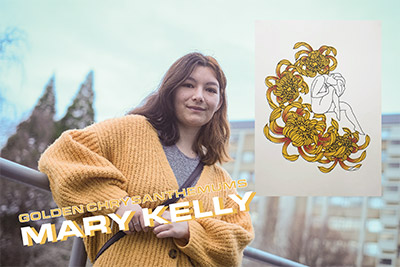
Golden Chrysanthemums by Mary Kelly
Mary Kelly is an unapologetically feminist artist. She studies art at Otago Polytech and is focused on doing “art that is by women for women of women. It’s really female-centred”, she said.
She had screen prints exhibited at the Art Week Exhibition. At the moment, screen printing is her favourite medium, after moving away from painting. “I draw up the design first, tweak them in photoshop, put in the colours I want or have the idea for, and then it’s a really annoying process of separating the layers out to their individual colour, then printing all of the lawyers individually to build up the image.”
She described the screen printing process as “long and tedious”, but loves the end result. “I never did screen printing before I came to Uni but now that I’ve got access to it, I love it. I’ve almost abandoned painting entirely,” she said.
Mary reckons one of the main benefits to screen printing is the reproductibility and increased accessibility of the artwork. “A painting is singular, but prints mean that everyone can afford something and have a $20 piece of art”, she said. She mentioned that having so many prints out there means that you’re not sure where they end up, or how people are reacting to them.
Serpent, one of her artworks, was a print that Mary originally designed as a back tattoo. Because of that, she thought carefully about the meanings behind the snake and the flowers it is surrounded by. “I went with daisies, they mean innocence and purity, which was nice to pair with the snakes which are usually seen as shady. Then the cosmos flower, I don’t quite remember the meaning of that one, but I wanted something positive because it has to go on someone’s body.”
Flowers and their meanings are important in another one of her prints too, Golden Chrysanthemums. “I was looking at the relationship between women and flowers and the meanings of these flowers”, Mary said. “The figures are happy colours and bright and colourful, it has an aesthetic look of being really happy and really nice, but then yellow chrysanthemums stand for insecurity. The figure is hunched over herself so it could be a sign of comfort in the flowers, or it could mean she’s closed off and insecure. It is really nice and bright when you look at it, but it also has darker undertones.”
Mary’s working on a few prints at the moment, and her focus is on trying to explore hyperfemininity through her at. “Yeah so girly-girls and things like that”, she said. “Sometimes in feminism it’s this absolute statement of everything women do is a political statement, you dress really masculine or you dress really feminine. My overall stance is you can dress however the hell you want and be pink and girly if that’s what you want.”
She said that even though her work is political, she doesn’t have fixed interpretations she wants people to take away. “Women are policed all the time, it’s just my two cents, so it’s all good if you don’t agree. I try to keep the interpretation fairly open.”
You can find her on Instagram at @femme_prints.