
Hannah Collier
Art Editor
Articles by Hannah Collier
26 articles found. Displaying page 1 of 3.
-
Culture
 Issue 27 12/10/2014
Review: Frances Hodgkins in 1913
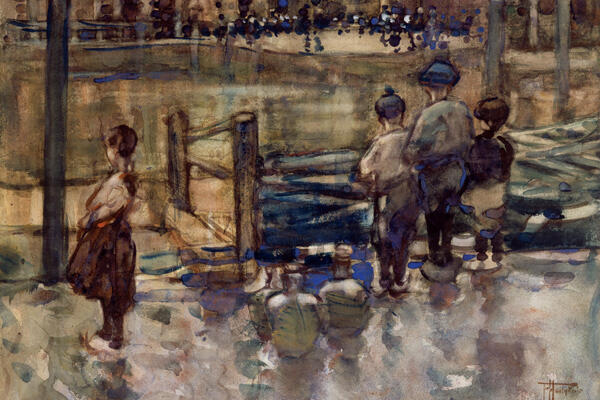
The Dunedin Public Art Gallery Dunedin-born artist Frances Hodgkins (28 April 1869 – 13 May 1947) was a painter primarily of landscapes and still-lives. She is considered one of New Zealand's most prestigious and influential painters, although it is the work from her life in Europe that is most reputable. Between 1901, when Hodgkins first went to Europe, and 1912, when she returned to New Zealand on 25 December, she travelled widely, making visits, sometimes very brief, sometimes extending over several months, to Scotland, Belgium, the Netherlands, Italy, Morocco, and England and she lived in France for almost five and a half years. She had her first solo exhibition in London, won two art competitions, and her paintings were accepted by prestigious institutions in Paris such as The Salon and the Societe Internationale d'Aquarellistes. Frances Hodgkins visited New Zealand for the last time in 1913, and the current exhibition at the DPAG is comprised of pieces that were purchased for public collections during that time. Referred to as a “photo essay” by curator Dr Roger Collins, the nostalgic collection allows us to enter into some of the moments, and the places she had them, during this time. Frances Hodgkins left New Zealand in October 1913 and this trip was the last time she would return to her home country before she would resume her journey towards international recognition. The works in this collection seem to display the unfamiliar places and cultures from her experiences, from the “dramatic colours of Morocco, [to] the fishing boats and market scenes of Caudebec and Concarneau.” They also demonstrate the place of people in her work, advancing from an exploitative fascination with the externals of dress and place to interaction with the inner personalities of those around her; such themes are repeatedly reflected on in the works acquired for Dunedin’s art gallery in 1913. The impressionistic painting of Hodgkins’ “Summer,” c.1912, captures the spirit of Europe in the summer season where people are playful, colours are fresh and the feeling is warm. In it, a man and woman mind a child under a tree, dressed in bourgeois (fashionable) clothing. The brushstrokes are gentle and the luminous colours dissolve into each other. Indeed, it is so picturesque it could almost pass as a scene in one of Beatrix Potter’s garden tales. The painting embodies the essence of its subject as it does not necessarily reflect nature but gives a sense of the natural forms appearing within the abstraction, suggesting Hodgkin’s interest in suspending the interactions of the different cultures she experienced in different countries throughout her life. This aesthetic extends to the other pieces in the collection, which share a similarly post -impressionistic style, with a specific attention to light and focus. “Dordrecht,” c.1908, is a watercolour piece on paper, which shows a scene from Dordrecht in the Netherlands, where she lived during that year, and also took a summer sketching class in 1907. The scene is typically picturesque and captures the landscape of the Netherlands at dusk through Hodgkins’ sensuous use of colour and free handling of the brush. Hodgkins keeps the colours within a purposefully minimal range, but the complementary contrast between the colours blue, red and orange is very carefully handled and gives the warmth and chill that comes with dusk. A reflective and nostalgic, but still fresh and joyful, exhibition, this private collection is not to be missed. Additionally, it should be noted that, as a tribute to Frances Hodgkins, the University of Otago Council established the Frances Hodgkins Fellowship in 1962 to aid and encourage painters, sculptors and multi-media artists, while at the same time associating them with the life of the University and fostering an interest in the arts within the University. The annual, 12-month fellowship provides a studio/office space and not less than the minimum salary of a full-time university lecturer. It is open to artists who are normally resident in New Zealand and who, in the opinion of the Selection Committee, have executed work that demonstrates their talent and would benefit from holding the Fellowship. In 2015 the Fellowship has been awarded to John Ward Knox.
-
Culture
 Issue 26 05/10/2014
Review: This World is your Oyster
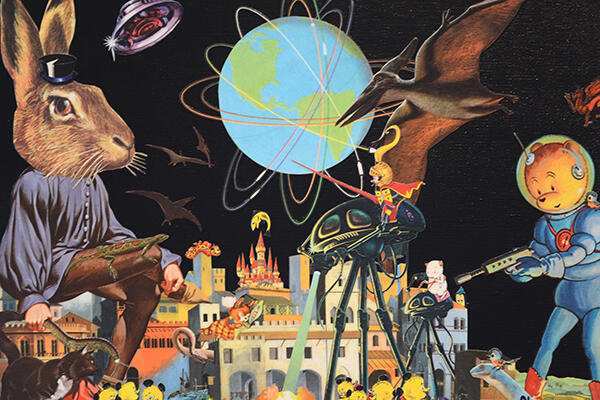
Mint Gallery New Zealand-based collage artist Peter Lewis has been forming, re-forming, configuring and reconfiguring popular culture and its images since 1990. Peter‘s work has been featured on CD covers in New Zealand and in the United States, in the San Francisco-based art magazine Churn and, more recently, in the New York art and fashion magazine Fifth Avenue. His work has been exhibited throughout New Zealand, in Germany and briefly (and without authorisation) at the Museum Of Modern Art in New York City. A selection of Peter Lewis’ work is included in the book Masters: Collage. Lewis admits that he has been “cutting up magazines and rearranging images for over ten years now, and some words to describe my collages might be: psychedelic; weird; lurid; and wry,” which perfectly describes the current exhibition at Mint Gallery, This World Is Your Oyster, too. Over the past decade, Lewis has been living, working and travelling around America, getting inspired by people, popular culture and places – Portland, most recently. His 2013/2014 trip to the US was a key source for his current exhibition. There he attended his first US show in Portland and spent two days in San Francisco with his art hero and mentor, master collage artist Winston Smith (album artwork: Dead Kennedys, Green Day, Ben Harper). Many of these pieces attempt to capture the transitory moments of travel, and instead of being carefully staged compositions, they are snapshots in time, which resemble a kaleidoscope of colourful and kitschy images, juxtaposed against one another. They all go in different directions, defying gravity and challenging the viewer to make sense of their surreal, contrived, wayward world. As a viewer of such compositions, one is required to make their own interpretations, embodying the thematic undercurrent of each piece, which draws attention to the magic of imagination. Most of the pieces are set in what I would assume to be space, as the background is black and each piece often features some kind of weird spatial looking image – like an asteroid, a UFO, a cartoon image of the world – with layers of other images arranged in the foreground. Each piece (especially “Travel is Dangerous” and “Fire Walk With Me”) pretty much looks like the result of a Hieronymus Bosch- or Salvador Dali-type, who took some acid, went into a 90s-kid’s cupboard, pulled put all their old posters and K-Zone magazines, cut them up and rearranged the images on a canvas to create a nonsensical, popular culture collage – in the best way possible. There are pictures of flying dinosaurs, fish-headed planes, fairy-tale characters, numerous rabbit heads, World of Warcraft characters, a moon, and Fantastic Mr Fox. I’m not really too sure how to make sense of the images collectively, but it is this nonsensical element that makes the work so fun to look at. It’s like reading Alice In Wonderland or Fear and Loathing; I feel like it’s so cool and maybe really clever, but what the fuck does it mean? Considering all of the works, I think this is the whole purpose; to question how we perceive popular culture and all its commodification. Popular culture is a messy but magical meshing of so many things – strands of history, culture, people, places, moments, everything – and it seems Lewis, in his art, is drawing attention to this, and asking the viewer to challenge the idea culture can be limited to one perception, when there is such an excess and every individual will interpret moments, artefacts – life – differently.
-
Culture
 Issue 25 28/09/2014
Unpainted
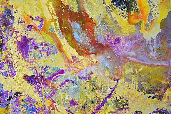
Blue Oyster Art Project Space Exhibited until 18 October 2014 I rarely get down to the Blue Oyster on Dowling Street, but every time I go there, I am always pleasantly surprised. Briar Holt’s Unpainted curation is a series of work by artists Kim Pieters, James Bellaney, Helen Calder and Fu On-Chung, whose work treats the medium of paint in an explicitly non-traditional way, drawing attention the out-datedness of generic painted canvas pictures. The exhibition shows the diversity of the medium, and how paint can be understood conceptually as well as aesthetically. “Considering painting as the premise for this exhibition but not the parameter ‘unpainted’ manifests in symmetrical configurations by drawing together four artists: two based in Dunedin, two based elsewhere; two positioned as emerging practicers, and two more established.” Each installation displays a different way in which the artist has used paint to remodel the idea of what a painting is, and how paint can be used. “Helen Calder’s suspended acrylic paint skins have no wall on which to hang, removing any framework that denotes that installation as a traditional painting.” Each red paint skin hangs from the ceiling from a silver hook – it kind of looks like silk that has been draped and solidified around a black rubber cord that swirls and accumulates on the ground, and at the base of each piece. The architecture of the skins is what the viewer is drawn to as it drapes and folds around the cord it is suspended by. In doing this, each piece, rather than reflecting some specific moment or object, appropriately draws attention to just the paint as it exists in its purest form. Calder’s use of intensely saturated colours is reflected in her title: “red, red, red, red.” “Kim Pieters’ dreamy moving image soundscape ‘Flame’ takes on a number of painterly qualities – picture soft focus renderings of Dunedin’s First Church steeple against a background of scumbling and swirling dabs of light.” The soft, low-resolution looking rendering of light works to attribute painterly qualities to the film medium – again, drawing attention to the idea of paint as a texture, a medium, and solo-substance, not just something which is used to reflect something else. James Bellaney’s pieces were my favourite in the collective exhibition. Bellaney’s work is generally quite dark and moody, with swirling brown and red and black paint often being used. But in this exhibition, Bellaney treats paint as what he referred to as a “purge” of his thoughts, which manifests in “dynamic and swirling textual elements which are created by the painstaking process of layering and manipulating the trajectory of paint as it travels across the surfaces of large scale panels.” The pictures are appropriately rested on the floor of the gallery, again, taking away that traditional feeling of “a picture on a wall.” It felt very saloon style and the paintings look like rainbow popsicles and marble bubble pictures. Definitely something different from James who claims colour is not his favourite thing to work with. Each of the works inherently imagine a sense of “painterly collapse” and Fu On-Chung’s canvases work most obviously to comment on the “potential redundancy of painting, masked with bright colours and light-reflecting wrapping.” His series of work almost look like microscopic photos of bacteria with bright-blotched colours in various shapes and forms on the canvas. Two of the canvases are covered in plastic which is so “unpainterly” to look at – it kind of rejects the whole point of looking at painting but, at the same time, is interesting and looks more like a sculpture attached to the wall rather than a painting. In doing this it appears that Chung’s work is a “bittersweet approach to painting as a practice.”
-
Culture
 Issue 24 21/09/2014
Barry Brickell - His Own Steam
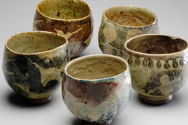
Dunedin Public Art Gallery (DPAG) Exhibited until 1 March 2015 The DPAG is clearly into ceramics at the moment and I have been enjoying the refreshing change from paintings to pottery. Barry Brickell is one of the pre-eminent contemporary potters working in New Zealand and is a pioneering figure in the development of contemporary indigenous art. This exhibition is the first retrospective survey exhibition of Brickell’s pottery, bringing together more than 80 works collectively. Each piece is taken from the Dowse Art Museum’s collection, which is over 60 years in the making, and Brickell’s own private one. The exhibition also displays publications on Brickell’s work, published by the Auckland University Press. The Dowse Art Museum’s senior curator, Emma Bugden, and sociologist David Craig curated some aspects of the exhibition, too. Brickell was born in 1935 in New Plymouth and was raised on Auckland’s North Shore. When he was 15 years old he met the talented potter Len Castle, who would become his life long mentor and close friend. While still in his teen years, Brickell co-founded the North Shore Ceramic Society, the first “formal” potters’ group in New Zealand. In his last year at Takapuna Grammar he worked an after-school job at a gas station and a brickworks, where he would use the commercial kiln to fire his own pots. In the early 50s Brickell attended Auckland University to study science and joined the New Zealand Forest Service as a trainee intern. After that he became a teacher in the Coromandel. Left unfulfilled with teaching, he threw himself into a full-time career as a potter and, since then, hasn’t looked back. The works are made out of salt-glazed terracotta and each piece shares a similar aesthetic – organic colours, indigenous patterns and unrefined rendering of the clay, which have a distinctively native feel to them – specific to Brickell. New Zealand’s natural environment is one of his greatest inspirations. The salt glazing, especially, makes the work look less like mismatched tea sets and more like art(ifacts). According to Brickell, salt glazing was once a key part in the development of commercial pipe production at the brickworks Brickell used to work at, and he quickly became partial to the distinctively “antique, nitty-gritty” style of the brick pipes – so much so that he transferred it to his own work. My favourite piece is the “Salt-Glazed Dog” (1989), which opens the exhibition. Its curvy body, small feet and upturned nose work together to create an almost comical representation of an every day thing. However, rather than just being cute, Brickell’s distortions and close attention to small details turn the viewer’s attention to the craft of making the piece itself. The surface of the dog, with all of its lumps, bumps and lines, really highlight Brickell’s raw working and reworking creative process. Another highlight for me were the “Spiromorphs,” his most well known forms, which are large-scale spiral creations built from curved and coiled clay. The Spiromorphs twist and unfold in expansive curves, drawing on the relentless energy of nature. His work resonates with his often quoted mantra, “not the thing but how,” that expresses his unique interest in the process of creating and the distinctiveness of a local voice. The salt-glazed stoneware sculptures have swirls that are reminiscent of the curves in Paul Gauguin’s Tahitian nude portraits. Indeed, Brickell’s earlier ceramic works also have a similarly native and primal aesthetic, with attention to process, not perfection, shared by Gauguin, too. As there are 80 pieces in the collection it is hard to narrow it down to two or three but, overall, Brickell’s work displays his advanced skills in pottery and the complimentary video provides deeper insight into his working processes across the years. You can find out more about Barry, his life, philosophies and prodigious work as a potter, painter, engineer, railway enthusiast, conservationist and writer at www.culturalicons.co.nz
-
Culture
 Issue 23 14/09/2014
Murray Eskdale and Tara Douglas
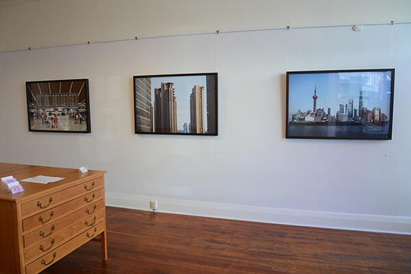
Mint Gallery Exhibited until 23 September 2014 Mint Gallery’s most recent exhibition, Au, features an exclusive display of photographs taken by owner/curator of Mint Murray Eskale and five digital prints from Dunedin artist Tara Douglas, who has previously exhibited “Karucha Shoku” and “Blossom” at the gallery. The exhibition is curated by Mint Gallery owner Murray Eskdale and exhibits some of his distinctively large photographic works (printed on aluminium) that capture his perception of the urban landscape that is Shanghai. Tara's contribution to Au is an evolution of the Japanese-inspired sculptural and photographic works seen in these exhibitions. Aesthetically, the photographs do not align in any way, but each similarly share Asian culture as a subject. In Murray’s images, the photographs show the urban spaces of Shanghai, from inside shopping malls, to capturing the great financial district, Lujiazu. His images are crisp and clean, effectively capturing his somewhat mechanised impression of Shanghai. Each of his images represents themes of urban life, concentrated by excess, mass production, consumption and an inherent detachment from the natural world. The first image captures what appear to be apartment buildings in central Shanghai, which each look like replicas of one another. The concrete buildings fill the composition against the blue-sky background, leaving only one strip in the middle of the photo that is bare without a building occupying its space, which allows the viewer to get a breath of the background. There is such a strong juxtaposition between the natural and man-made elements within the photo, one cannot help but align such a contrast to that of the struggle of the modern man who is endlessly trying to make sense of the urban world against the natural. My favourite image of Murray’s is the clever capturing of Lujiazui. Since the early 1990s, Lujiazui has been specifically developed as a new financial district for Shanghai. It is located on the east side of the Huangpu River in Pudong, and sits directly across the river from the old financial and business district of the Bund. Murray took the image from the East side of the river, staring at the city against the skyline, and the image is strikingly surrealistic. The image is divided into three horizontal sections on the photo plane, and each is symmetrical to the other, so the lines look clean and the image is balanced. The bottom section is of the water in the foreground, the middle section displays the concrete jungle that is Lujiazui receding into the background, and the top section is blue sky, which again is in stark juxtaposition to the city skyline it is compressing. What is most interesting about the image, however (Murray had to explain this to me as I thought I was looking at a floating city), is that he captured the image at just the right moment – as a boat was passing along the river, in front of the city on the skyline, it aligned with what appears to be the bank of the river beneath the city and, surrealistically, it looks as though the city is indeed floating on water; I think it is quite a remarkable image for its purely surrealistic properties, which are both confusing and convincing. On the other wall of the gallery, Tara Douglas’ five images, “In Praise of Shadows, I–V,” are displayed. Each image is a manipulated version of the other, capturing a different moment, angle or composition of the artist and her paper blossoms. In traditionally Japanese colours – red and black and white, with infusions of pink, – the photographs are subtle, authentic and playful. With Asia seeming to be Murray’s point of interest this month, Tara’s works tie in well with his own oriental photographs. If you haven’t seen them already you should pop into Mint for a look – Shanghai looks fascinating, and even more so in the way that it has been so artfully captured. Ask to see Murray’s Europe prints if you go into Mint as well – they are equally as brilliant.
-
Culture
 Issue 22 07/09/2014
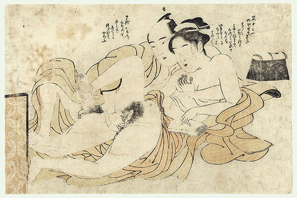
Keisai Eisen - Shunga
Brett McDowell Gallery Exhibited until 18 September Throughout the 17th, 18th and 19th Centuries, Japanese Ukiyo-e artists, alongside their normal print production, were involved in the creation of erotic prints, which are generally known as “shunga.” Translated literally, the Japanese word “shunga” means “picture of spring;” spring being a popular euphemism for sex. Shunga works express an explicit, but exquisite, world of sexual possibilities in the most idealised and erotisised way possible. And the exhibition of Keisai Eisen’s eleven works at Brett McDowell Gallery is a rare, but exciting, chance to see some of the images that still remain officially prohibited in Japan. Each of the eleven prints are, on average, 240mm x 350mm in size, and show an image of what I would assume medieval soft-core pornography would look like. Keisai Eisen (1790 – 1848) was a Japanese ukiyo-e artist who specialised in Bijinga (“pictures of beautiful women.”) His best works are considered to be masterpieces of the "decadent" Bunsei Era (1818–1830); the majority of the pieces displayed at the Brett McDowell Gallery were completed during this time. In addition to producing a prolific number of prints, Eisen was also a writer, producing biographies of the 47 Ronin and several books, including a book that documented the lives of the ukiyo-e artists. His supplement is known as "Notes of a Nameless Old Man," where he describes himself as “a dissolute hard-drinker” and claims to have been the “owner of a brothel in Nezu in the 1830s which had burned down.” Perhaps this is where he drew some of his rawly erotic inspiration. As a whole, the body of work does not follow any coherent narrative, but rather appears to represent sexual tableaux of Japanese erotic culture during this time – to be less PC, I feel like the body of work could be bound and used as a handbook on “how to have kinky Japanese sex” for Western amateurs. Otherwise, the variety of sexual techniques, situations, positions and possibilities – whether heterosexual or homosexual – that are expressed in the works seem to provide an uncensored glimpse into the sexually explicit everyday life and culture of the Japanese high courtesans in this era. In one image, there is a male lying on top of a female whose genitals are completely exposed – and at a significantly larger size than natural. It is obviously quite pornographic but once you get past the confrontation that comes with images of genital exposure, getting lost in the sophisticated colour patterns, swirling kimonos and silk robes that repeat the curves and undulation of the female’s vagina is inevitable, and, despite the fact that a vagina is literally staring you in the face, the delicacy of detail, the fineness of the ink line, and sensuality of colour palette (subtle shades of red, pink, blue and cream) make the image inherently more tasteful, than what could be otherwise perceived as tacky. The inclusion of traditional Japanese imagery, such calligraphic symbols and Japanese fans, also enriches the image with cultural references, reminding the viewer of the images’ foreign origin, which were separate from the censored conventions of the Western world. Among the other images are scenes where dildos (daggers) and other sexual surrogates are employed, as well as a couple of loaded lesbian scenes where the two females are playing with each other’s vaginas while some boats float by in the indicated outdoor setting. The casual setting depicts the impression of a totally uninhibited sex life that was the reality for the Japanese courtesans during this time. To the modern viewer, each image gives a similar impression to which Klimt’s earlier nude sketches invoke – there is a similar sense of sensuality and softness that undermines any sense of perversion and purely pornographic perception. The way in which some of these scenes are infused with such a passion, suggests the unimaginable lives of Ukiyo-e artists in Japan during this time. Unable to think of a contemporary artist that could equate to such impressions given by Eisen’s images, all that comes to mind are PornHub and Hayao Miyazaki films. How could you not want to go and see it?
-
Culture
 Issue 21 31/08/2014
Profile: Zac Fay
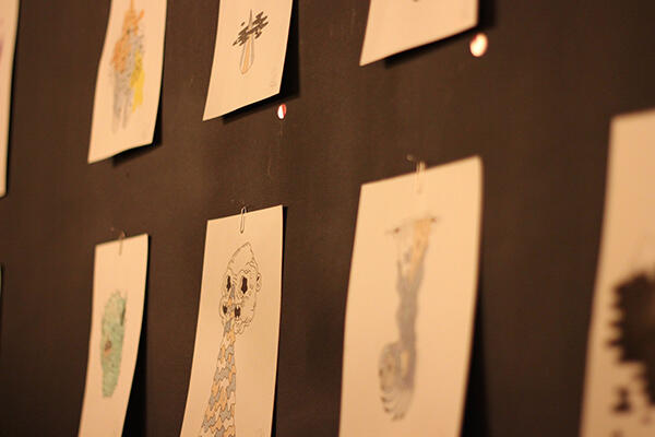
Last Friday night I went to Dunedin-based artist Zac Fay’s first official exhibition, Blood Eagle, at Kiki Beware on George Street, and it was so effortlessly great. Unfortunately the exhibition is now over, but because Zac is local, naturally I felt it would be appropriate to meet and greet and discuss art in the flesh, so we sat down at Nova for a quick espresso. Fay is 23 years old and was born and bred in Dunedin. Aside from spare time doodling, he worked for a year as an assistant at Van Brandenburg architects in Dunedin before he left to study marketing. The architectural elements of his work and his decision to exhibit it in a clean, modern and architecturally reflective space stemmed from his interest in architecture. Other than that, he gets a lot of inspiration from cartoons and other illustrative artists. His favourite graffiti/street artist is American contemporary illustrator and street artist Neckface, whose work is generally congruent with Fay’s. The exhibition at Kiki took Fay a month to do and was comprised of eight A4 pieces, six A5 pieces and two A3 pieces. In terms of the creative process, he says his process is quite basic but it works. Fay starts with a light pencil outline, which he then goes over in ink, before filling in chosen areas with water colours and the occasional hint of gouache. Fay’s images are what he describes as “creepy and creature-like” but still friendly as the characters and images appear both comical and cartoonish. When I first saw the exhibition it reminded me of Salad Fingers, but not so anguished and cynical. The creepy subjects are juxtaposed with subtle saturations of water colour that “tone down the subjects a bit,” as they contrast the sharpness of the black inked lines and in doing this, instead of appearing horrifying or gruesome, his images feel more light-hearted and seem to represent a specific state of ironic, modern melancholia. This theme runs through his whole exhibition with images of things like stubbed-out cigarette butts and daggers with blood on them, filed lightly with pastel-like blue, red and black watercolours. His work is playful but well-constructed and is thematically coherent. Outside this exhibition (in Dunedin spirit) Fay has collaborated with other local creative friends and fellow artists, including commissioned prints for local brand Clothes I’ve Made, where he designed t-shirt prints: “I did a Gucci-esque print for them, and a Street Sharks inspired one.” Fay has also done some work for the Public Gallery and has extended his reach to Melbourne, where he has done album covers for his friend, Scapegoat Mercy (soundcloud.com/username-21). With not much else to say about his work apart from the fact that he was overwhelmed by the positive response, numb by excitement on the night, and thankful to his girlfriend, Briar, for being the “brain” behind his creative impulse, Fay finished his long black before he pulled out his sketchpad showing me a quick drawing of a bloody dagger he had done for a best friend and, gathering his things together, he assured me he would pen me a piece that features knives and blood and cigarettes – specifically, a dagger impaling a bunch of cigarettes. Fabulous! Uncertain when his next exhibition will be, Zac is enthusiastic to keep drawing and working, and I am looking forward to seeing more in the future.
-
Culture
 Issue 20 18/08/2014
Gary Currin
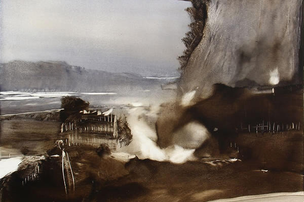
Milford Gallery Exhibited until 27 August 2014 Gary Currin was in Wanganui in 1952 and has been exhibiting his work since 1976. His paintings and exhibitions have gained national momentum, placing Currin within the sphere of significant New Zealand artists alongside people like McCahon, Hotere, and Woollaston. Currin was a finalist in the Wallace Visa Gold Award in 1999, and a finalist in the James Wallace Awards 10 times since 1995. He also won the “people's choice” vote in 2004. In 2008 Currin won the grand prize in the Team McMillan “Where Brush Meets Bonnet” BMW Art Award and, in 2011, a merit in the NZ Painting and Printmaking Award. His work is included in various significant collections and, excitingly, he is currently being exhibited here in Dunedin at the Milford Gallery. The exhibition title, Hints for the Incomplete Traveller, encapsulates the experience of Garry Currin’s paintings. The works are suggestive rather than explanatory; Currin tells part of the story but leaves viewers time and space to extend and complete the narrative as it suits them. From my perspective, the painting seems to reflect the moments a traveller vaguely remembers. His work is stretched across the gallery walls, drawing on cinematographic traditions of representation. Currin’s paintings allude to sepia-toned photographs or frames from faded eight-millimetre film and each small panel reveals a self-contained world where individual stories overlap and time and place are fluid. Currin directs the framing and focus of each “shot,” revealing only parts of the wider narrative structure and, in this, it seems that Currin's paintings are not merely allegories conveying meaning through symbolic representation, nor do they seek to imitate reality. Rather they employ a sort of lyrical form of abstraction, where the emotive and expressive qualities of colour, shape and brushwork, capture first the artist's feelings, and subsequently the viewer's. Landscapes appear to be the subject, yet the dark shades, the atmospheric smudges of light and shadow, present moments of another world that shifts between experience, memory and dream. The oil paint allows for this type of rendering, as the fluidity of the medium parallels the fluid nature of memory, dream and reflection, as it passes through our thoughts as flickering, blurred fragmentary images. It’s very Edvard Munch. The individual paintings in the exhibition are small, intense works and they radiate within their delicate frames. Currin uses overexposed points of light as visual signposts that draw the eye into and across the surface of the panels. Using a limited palette, he layers tone upon tone, creating a rich depth within the lightness of the framework. More figurative than his earlier bodies of work, Currin has populated the stories with people and places that are almost recognisable. (Almost, as they appear as half-forgotten memories, which have warped and changed over time.) Accompanying the “storyboards” is a single large work on canvas, which showcases Currin’s skill with his medium. From a raised point of view, the viewer looks down onto a shifting landscape that is touched with light. Dominating the foreground are shadowed plains and a solid sweep of hillside; Currin captures simultaneously the solidity of the landscape, and its mutability. Behind Currin's paint application lays a history of New Zealand's art. If we are looking for signs of our painterly traditions there are hints of John Gully's somewhat Arcadian landscapes, a certain darkness of the New Zealand psyche implied by Colin McCahon, and even Toss Woollaston's "mountainous scrumblings," come to mind when looking at Currin’s work, but in the end Currin's paintings provide us with a visual negotiation of man's subtle and shifting relationships with the land, with history and with our sense of the spiritual.
-
Culture
 Issue 19 10/08/2014
John Ward Knox & Sophie Bannan
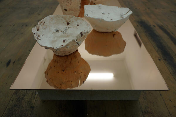
Blue Oyster Art Space Exhibited until 23 August 2014 The Optimists is a new work by Christchurch-based artist Sophie Bannan and Auckland-based artist John Ward Knox, and is currently being exhibited at The Blue Oyster Art Project Space. While each artist presents a series of work unique to their current practice, The Optimists offers a parallel moment between the two artists. It is a space for the two to collaborate without any preconceived themes or constructed ideologies. Originally from Melbourne, Sophie Bannan is currently completing an MFA in Christchurch. Sophie also writes semi-fiction, cultural criticism and exhibition reviews and has recently written for Point Magazine and The Physics Room. She founded artist-run initiative Strines (Melbourne) and co-founded Personal Best Gallery (Auckland). Recent solo exhibitions include Variations, Knight Street Art Space (2013) and I am in the middle, Rearview (2013). In early 2015, she will be attending the Mountain School of Arts in Los Angeles. John Ward Knox holds an MFA from the University of Auckland (2008) and was a founding member of Newcall Gallery (Auckland). Recent solo exhibitions include Breathing After Thinking, Ivan Anthony (2014) and a lightening strike, a hand on a shoulder, Robert Heald (2013). He has been part of the group exhibitions New Revised Edition, City Gallery Wellington (2013) and Contact. Artists from Aotearoa/New Zealand, Frankfurter Kunstverein (2012) and in 2008 he won the National Drawing Award. Both artists are interested in similar practices regarding form, space and material and this exhibition reveals how each artist is able to effectively render form, through various manipulations of material, to generate different responses to the objects. Moreover, the artists bring attention to the fluid concept of space, emphasising how it can alter one’s perception of any object. When you first enter the gallery there is a low table with a delicate wee sculpture assembled lonesome on the top of the reflective table – notably reflective as the pots are actually white, but the copper toned surface makes their reflection look like raw terracotta; it’s so organic. The object literally looks like a handle-less teacup/upside down mini volcano made out of asteroid remains, solidified cookies and cream, and those weird paper-thin shells you find on North Island beaches that have black speckles on the surface. Regarding space, my initial thoughts were “it is really weird how such a small object can impose feelings that are totally unrelated to the object itself.” I genuinely felt sorry for it because it looked so significantly insignificant. After a moment of contemplative pity, I moved on to the next room, where nine of the small pot/teacup-with-no-handle objects are similarly assembled (but in a zig-zag kind of arrangement) on another table that has an identical surface to the one mentioned before. I really appreciate the material coherency here and the tables stood out to me more than the actual objects. The objects are in a smaller space and there are more of them, so naturally the general feeling was a lot less lonely and a lot more intimate. I stayed in there for about five minutes observing. Again, I was more interested in the reflections than the actual objects, and in this instance of thought, I couldn’t help but consider some qualms of contemporary culture – does the image, or the object generate more meaning and value? And why? And how does the space it’s represented in contribute to that? (Art being art, I was told there is no certain answer to my questions). In this exhibition each artist has an interest in material and spatiality; and each of their work revises, evaluates and compiles new materials and spaces. In The Optimists, each object is reworked in a slightly different way, and is presented in different spaces, fuelling numerous feelings around what fundamentally (materially) appear to be the same objects. This suggests how each object questions and challenges ideas about how a material can express itself in a most basic way, while simultaneously hosting an external realisation. The exhibition encourages the viewer to see “things” as objects, whose surface is a mere indicator of a far deeper volume beneath, and I’m probably going to drag all my friends there (I say drag because I’m sure they get sick of me taking them to galleries all the time) and try to make them understand life a little bit more, one exhibition after the other! You should do it too. It’s on display until 23 August.
-
Culture
 Issue 18 03/08/2014
Michael Parekowhai
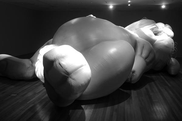
Dunedin Public Art Gallery Exhibited until 9 November 2014 Michael Parekowhai (born Porirua, 1968) is one of New Zealand’s most important contemporary artists. Parekowhai acquired his BFA (1990) and his MFA (2000) from Elam School of Fine Arts, University of Auckland. In 2001 Michael was awarded an Arts Foundation of New Zealand Laureate and since then, while still exhibiting, Parekowhai has been an Associate Professor in Fine Arts at the University of Auckland. His exhibition history spans almost two decades. Creating a broad range of work across a range of media, including sculpture, installation and photography, Parekowhai’s work plays with space and theme in a quirky, subtle and humorous, yet still challenging, manner. I have been a fan of Parekowhai’s work since I first saw the images of his two inflatable bunnies (Jim McMurty and Cosmo) in New Zealand art collectors Jim and Mary Barr’s book, Reboot, which is a reflective compilation of their personal collection from a range of renowned contemporary New Zealand artists. I purchased my copy for only $20 at the DPAG, and I really rate it as a simple, but significant, art read. Initially the bunnies were designed for the three- month-long 2002 Scape: Art and Industry Urban Arts Biennial, where Parekowhai suggested that he turn Cathedral Square in Christchurch into a playground for the bunny and its partner (Cosmo) – but the proposal was ill-fated, as was the consent process, so it took a little longer and they never quite made it into Cathedral Square. However, Jim McMurty and Cosmo have been well travelled-since, and now in 2014, the bunnies have been exhibited in places as far as Korea, Canada and Lithuania. Now, finally, Jim McMurty is here at the Dunedin Public Art Gallery – just filling space snoozing and looking cute. I am thrilled to have been able to see Jim McMurty in real life. The inflatable Jim McMurty is characteristically large in scale, and sprawls itself flat on its back across the gallery floor, at 12 metres long and 4.5 metres wide. With limp whiskers and a bushy tail, one eye is closed, and the tongue hangs lifelessly out one side of its mouth, as if stars should be circling the rabbit’s head. Aesthetically, the piece is comical and cartoonish and it reminds me of Bugs Bunny or Peter Rabbit. In a word, it’s quite charming. Even its size isn’t uncomfortably confrontational, demonstrating how Parekowhai cleverly maintains subtlety with what I would call super-scale objects, as a real life bunny would probably be smaller than Jim McMurty tongue. There has been controversy surrounding the significance of the bunny/bunnies, with people questioning: What does it represent? What does it mean? How is it art? But for me, that is the whole point of it. It shows that art cannot be defined by one set of rules or expectations. The bunny for one person is cute and childish and adorable, and for another it is a weird oversize representation of a colossal pest. For some it is a symbol of colonialism, and for others, a mere mascot of popular culture. I was talking to someone who was at the Dunedin Public Art Gallery who shared the same passionate interest in Parekowhai as I do, and they mentioned they had encountered a visitor who had viewed the piece and didn’t “get it” because it “didn’t look like art at all.” The mere fact that the piece exists as an aesthetic object in a gallery I think is what constitutes it as “art” for the general public, but on a more profound artistic level, it is important to understand when looking at art (particularly Jim McMurty), that the object is not confined by any (nonexistent) “rules” or any specific identity, or any specific anything, for that matter – it merely exists as an open possibility of meaning. Walter Pater (my favourite aesthetic theorist) once wrote that what makes it art is that some mood of passion or insight or intellectual excitement becomes irresistibly real and attractive and fun for us for only that moment when we look at the object; and that’s why I like Parekowhai’s bunny so damn much. It brings together memories of childhood, moods of creative impulse, and little moments of intellectual reflection. The second version of the bunny, Cosmo (not on display) is part of the National Gallery of Victoria Collection and that’s my next Parekowhai stop. On loan for an extended duration, the bunny will be resting in the DPAG for a while longer, and it shouldn’t be left unseen.
-
Culture
 Issue 17 27/07/2014
Paul Maseyk
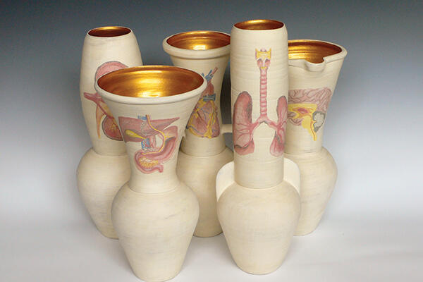
Dunedin Public Art Gallery Exhibited until 30 November One Pot Wonder is literally a one-pot wonder, as there is one pot (it stands at about two metres tall), and it makes you wonder. Along with the rest of the survey exhibition, which is equally as wondrous. The exhibition as a whole is a retrospective of Maseyk’s work from the last 10 years and focuses heavily on the artist’s unique, personal and highly detailed ceramics, highlighting both the finely painted surfaces and the wide sculptural variations. Maseyk graduated from Wanganui Polytechnic in 1997 and since then, he has become renowned for his use of unique sculptural forms and representations of personal experiences and ideas through complex surface illustrations. He is represented in numerous public collections throughout New Zealand, including Te Papa Tongarewa, The Dowse Art Museum and the Auckland War Memorial Museum, and is currently in the running for the $15,000 National Contemporary Art Award. Maseyk is nationally renowned for producing ceramic works exploring numerous avenues in terms of style and form, but his signature style of work is significantly concerned with classical Greek forms, elaborated by his contemporary, marvellously surreal designs that animate the surface of each object. Maseyk has commented on his work, saying that a favourite part of his creative process “has been mimicking Greek amphorae, which had frieze work along the top of the vase and pictures depicting everyday life.” Such motifs of everyday life are exemplified in One Pot Wonder, including: images of crashing planes (corrupt America? He spent time there on scholarship); women; cows; corporate brand logos (Dole and Playboy); and food. The decorative elaboration on the larger standing works such as One Pot Wonder and Commando Maseyk versus the Zig-Zag Man, is so heavily detailed it is as though the surface is being treated as a canvas. Maseyk even uses liquid coloured clay as paint to do his drawings – I mean, #Mixedmediamaster. In terms of style and form, it is significant to note that although the ceramic medium offers a starting place, ultimately his work seems resistant to categorisation. His large-scale ceramics share many of sculpture’s concerns – staging a bodily encounter, actively interrupting the viewer’s experience of space, asserting their materiality and form – so, theoretically, I would feel inclined to call them “sculptures,” but sculptures naturally stress surface and form so severely that it almost feels as though calling his works “sculptures” would diminish the finer detailing found in each piece, which I think holds the most value both conceptually and aesthetically. They’re sort of like visual shrines for the artist’s emotions. Finally, I couldn’t help but recognise the fact that numerous vessels, particularly Big Yellow, Big Orange and Big Blue, which were commissioned specifically for this exhibition, look undeniably similar to certain forms of weed-smoking paraphernalia (a really brightly coloured and shiny bong). I wonder if Maseyk smokes pot – and whether this aids his surrealistic vision. Surely that kind of detailing doesn’t just stem out of sobriety? Either way, if you’re into pot(s) and brilliant illustrations – you should see this exhibition.
-
Culture
 Issue 16 20/07/2014
Yona Lee - Specific Objects
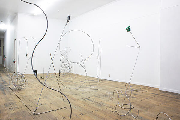
Blue Oyster Gallery Exhibited until Saturday 26 July Yona Lee is a Korean-born artist (and former cellist) currently residing and working in Onehunga, Auckland. She acquired an MFA from Elam School of Fine Arts in 2010, leading to her most recent exhibitions including Tangential Structures, Enjoy Public Art Gallery, Wellington (2013); Line Works, Art Space, Auckland (2012); Composition, Te-Tuhi Centre for the Arts, Auckland (2012); and Constrained Organism, Open Window and Govett-Brewster Art Gallery, New Plymouth (2011). On the objects she chooses to display in her sculptural forms, Lee writes: “I am interested in the things that are usually hidden, and things that are not a subject matter but rather a supporter. These banal objects or tools are humble in that they don’t demand other’s attention of their existence. My desire is for these hidden objects to receive the same amount of focus as the work itself and reveal their hidden beauty. Their humble existence is beautiful.” We can see in Specific Objects how Lee has used every day objects, such as paintbrushes, scissors and earmuffs, to draw attention to the changing role of such objects in the post-industrial world. Each object hangs from various rods of steel that erect from the heart of each sculpture, like withered fruit hanging off dead twigs. Lee’s use of steel is appropriately made less aggressive and definitive by its curvy construction, displaying Lee’s interest in the utilisation of industrial materials in the modern world, and the objects attached to various parts of the rods (as aforementioned) suggest the shift from a industrial/labour driven economy, to the creative/capital-culture economy that we currently find ourselves living in. While still in conversation with minimalism and formalism, stylistically, Specific Objects does divert both aesthetically and conceptually from previous exhibitions. In Composition (2012), Lee’s artistic enquiry melds the formalism of classical music with an exploration of space and industrial materials, reminiscent of 1960s minimalism. Through this work, Lee enters into a conversation with the legacy of minimalist artists such as Sol Le Witt and Fred Sandback. Her reference to classical music, however, derails this association to problematically introduce sentiment within the piety of formalism. In Specific Objects, the shown objects and steel structures stand more singularly superior to the space in which they are being shown. Lee has used a machine that bends steel using different sized discs. Lee compares her engineering of the rods to playing the cello, saying: “You have a limitation of sound that you can produce, but within that you do have a lot to work with.” Lee takes her exhibition title from Donald Judd’s seminal minimalist text written in 1965, in which he passionately espouses his views on the use and effects of industrial materials in sculpture. In this text Judd wrote: “Formica, aluminium, cold-rolled steel, Plexiglas, red and common brass, and so forth. They are specific. If they are used directly, they are more specific. Also, they are usually aggressive. There is objectivity to the obdurate identity of a material.” Lee’s evocation of this text traces the shift in ideology around the material object. Here Judd’s notion of the “specific object” (one, seemingly of pure form and objective materiality) becomes a counterpoint to contemporary conceptions of the material object as amorphous—as continually constituted by the slow warp of cultural thought. In Specific Objects, through Lee’s meticulously measured, cut and welded rods of steel, combined with the lingering presence of mass-manufactured objects, Lee draws attention to the dramatic shift in the ecology of the object as its identity changes with the rise of the immaterial, post-industrial phenomena. Lee ultimately makes a metal mockery out of millennial materialism and it is banal brilliance. Stylistically fresh, and on for another week, this exhibition is not one to be missed.


