
Hannah Collier
Art Editor
Articles by Hannah Collier
26 articles found. Displaying page 2 of 3.
-
Culture
 Issue 15 13/07/2014
Suji Park - Anu
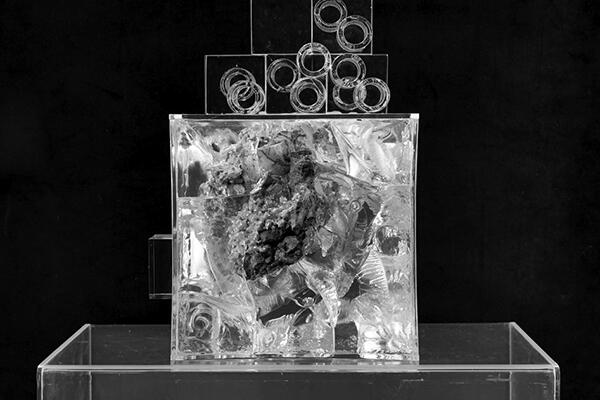
Brett McDowell Gallery Exhibited until 16 July 2014 My introduction to Suji Park’s work was serendipity, and I’ve been emotionally involved with her sculptures (and photography) ever since. I was in my friend’s apartment and he had his recently purchased Park positioned on a table in the corner. Naturally I had assumed that he had just got inspired one night and decided to elaborately embellish a rock – completely naïve to the fact that the object I had spent the past hour getting lost in, was in fact a Suji Park sculpture. It wasn’t until I picked it up off its perch and waved it round in the air, exclaiming my love for it (in all its cosmic-looking glittery glory), that I was made aware of its actual artistic significance. Shocked and mortified, my friend responded to my intrigue (in hindsight – stupidity): “Hannah, put the $4,000 art work down!” Suji Park is a contemporary artist, of Korean descent, based in Auckland. Since graduating from the Elam School of Fine Arts at the University of Auckland in 2010, her unique practice has quickly gained notable recognition throughout New Zealand. Park is repeatedly concerned with nature and form. Her engagement with her work and material takes an approach that involves the “recovery, analysis and reconstitution” of her own material, allowing for her work to naturally progress both thematically and practically. Anu is Suji Park’s third exhibition at Brett McDowell Gallery, and is a further progression from her previous exhibitions, with the inclusion of disfigured human forms made out of fired-clay and metallic glazing; aluminium powder; pigment; and other reconstituted materials. But, in this exhibition, her characteristically animalistic/figure works are accompanied by simpler, less constructed full vessel forms and abstract pieces. “Vessel” I, II, III and IV, which, although they appear to look like fired clay, are actually beaten bronze, steel, aluminium and brass, give the deceptively similar effect of fired-clay, displaying Park’s clever and effective creative capability. Each of the works are arranged in the gallery in a typically Park exhibition manner – spatially separate from one another, standing singularly on varied, in height and colour, plinths, facilitating an uninterrupted, fully immersive visual deconstruction of each of the nine pieces on display. The first piece in the exhibition is mother of pearl magic; a vessel of white acrylic on fired clay, embellished with clear, clouded quartz crystals standing on a pure white plinth, and it is simply stunning. The piece appropriately sets the viewer up for the progression of the more detailed pieces where Park introduces colour and a wider range of materials, as seen in works such as “Vessel With Eight Rings,” “Yua,” and “Hu,” which are fired-clay constructions, aesthetically enhanced by numerous materials that include graphite, tempera and gold leaf. Also detailed with geometric and pigmented patterns (literally looks like real-life stardust) and finished with metallic glazing, the pieces appear to be a refined amalgamation of her previous, and present ideas. “Yua” and “Hu” in particular, exemplify the artist’s interest in the regeneration and remaking of work, as each piece displays characteristics of both animal and human forms as seen in previous exhibitions, through the rendering of human faces and animal features, which force and stretch themselves out of various parts of each object – creating an almost disturbing, but nonetheless fascinating result. “Anu” is my favourite piece in the exhibition. It radically differs from the others in form, material, and construction. It dramatically combines various medias, including fired and unfired clay that is embellished with gold leaf, tempera, garnet, pigment and mica epoxy and is all embedded in a resin, plastic and Perspex cube, with some obscure cylinder shapes arranged and attached to the top. Confusing and characteristically complex, the piece (in my opinion) is the most enigmatic and interesting to observe. It’s like looking into space from a telescope – there are so many areas of colour, texture and structure, in which the more you look, the more you discover. Each piece seemingly provides refuge from the anxiety and uncertainty of the things we don’t know in the real world; and Park’s exceptionally close attention to detail fosters a sense of nostalgia and wonder, as well as addressing the lingering possibility of something more concrete, such as the satisfying sense of discovery through an inevitably trapped gaze. On show for another week, this exhibition is not to be missed.
-
Culture
 Issue 14 06/07/2014
Brian Alexander - Coppertone
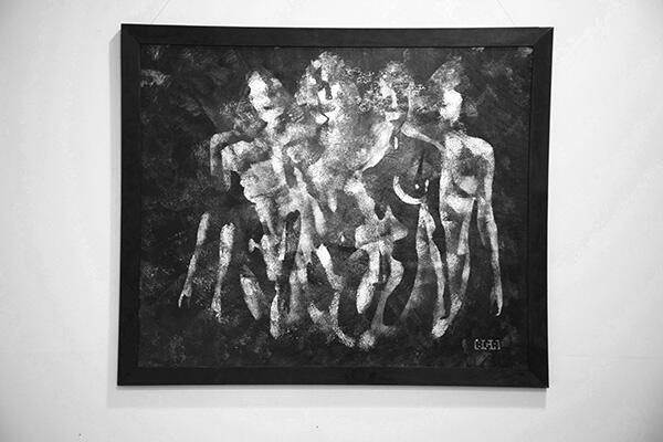
Mint Gallery Exhibited until 10 July 2014 Dunedin artist Brian Alexander unveils yet another solo exhibition in Dunedin at Mint Gallery this week – Coppertone. Combining influences from his original designs as well as other topics of the female form, the exhibition is comprised of 18 works, each varying in size all less than 1m x 1m, and ranging in affordable prices that sit between $150-$850 – reasonable for budding collectors. Since 2007 Brian Alexander has been an exhibiting artist. In 2007 he was accepted into local business art exhibitions such as Edinburgh Realty’s and Hope and Son’s, as well as being accepted into various art society exhibitions. In 2012 he debuted his first solo exhibition, A New Beginning, in the Dunedin Community Gallery, before curating his own exhibition in the Port Chalmers Town Hall in 2013. This was followed by his success in the Carey’s Bay Hotel charity art auction, where he entered and sold numerous works, and most recently he has been accepted into the 2014 Christchurch Art Show. A New Beginning seems to be the most direct influence on Coppertone in both style and subject. A New Beginning featured 31 abstract works, with motifs ranging from Maori symbolism to eclipses and coronas of the sun using acrylic paint, combining both neutral and metallic hues in textured layers. Alexander has confessed he is “interested in the thin veneer that covers society, saying: “Once you cut through that fabric, what lies behind it?” Justifying his interest in the conflict between what is, and what lies behind what is, and the relationship between nature and humanity. Alexander has produced a series of metallic works, covering the topics of the female form, portraits, faith, relationships and original designs inspired by nature and his imagination. In Coppertone, not dissimilar to A New Beginning – Alexander has utilised the luminescent earthly tones of black, red, gold, silver and, of course, copper to achieve images with a visual impact that stimulates contemplation on what lies beyond empirical experience. Painted on plywood, framed with raw wood that has been dyed black, the works are explicitly organic in both content and form. Moreover, the background of each painting is very similar, linking each painting to one another creating overall coherency. Murray Eskdale, curator/owner of Mint, suggested that Alexander had adopted the technique of pressing paint on plastic bags and then transferring the result onto the surface to create the background texture. The exhibition starts with the largest painting, Mantis – which displays Alexander’s interest in layering and texturing colour using both acrylic and spray paint to create dimension and definition. Alexander creates a scene of four nude female figures painted in metallic copper as well as combining areas of blackness with negative white space to create suggestions of form – a technique applied to all of the paintings in this particular exhibition. The figures remind me of a less angular and constructed, more blurred and textured version of Picasso’s ladies in his 1907 masterpiece “Les Desmoiselles d’Avigon.” Bar the blue areas, and I don’t think Alexander’s females are prostitutes; there is a similarly intriguing mythically and subtly sexually loaded aesthetic that reflects his interest in the female form. The artist also includes a self-portrait in which one half of his face is painted in gold and copper tones, and the other half is completely black space that recedes back into the canvas, and is defined by the background colours – so ominous. Other works include portraits of musicians, including Tim Finn, and other various objects and symbols including crosses, eclipses, and “cracks” – which literally show cracks in the surface of the wood, reflecting Alexander’s continual interest in what “lies behind.” The titles of the work, “Portal 2,” “Crack in the Wall” and “Into the Gap” further imply his intrigue with what is beneath the surface. It is interesting to notice how symmetry seems to be a point of interest for Alexander, as numerous works are divided in the middle by either a line, or change in colour, or some defining visual feature which creates visual conflict on each half of the canvas. This is appropriately in dialogue with his counter-balanced subjects such as male/female – nature/religion – relationships/the self. Alexander’s works are both stylistically and conceptually multilayered, and Alexander’s unique representations convey the tension he observes between humans and nature. Alexander’s Coppertone is interrogative, imaginative and radical, yet still remains understated and profoundly thought provoking.
-
Culture
 Issue 13 25/05/2014
Form and Void
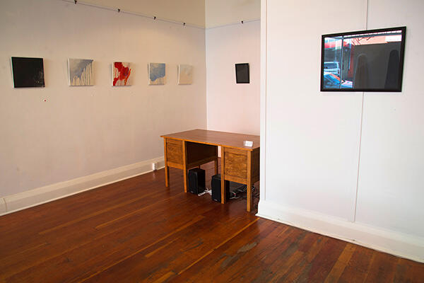
Mint Gallery Exhibited until 29 May 2014 “Form and Void presents a study in contrasts by staking out a liminal territory between cadence and dissonance, presence and absence, potentiality and actuality. While eschewing iconographic elements, the work of this collection continues to engage with wider thematic narratives concerning the nature of creation, being, apocalypse and redemption.” I have been going to Mint Gallery a lot recently because their exhibitions have been developing strongly all year, and I have been really enjoying my time there. I recommend joining the mailing list for opening nights (free wine); often the artists are at the openings and can sometimes string together an inspiring sentence or two, which is nice. The current exhibition on display is Form and Void by Brendan Jon Phillip. It’s morbid and anxious, passive and introspective, and the artist continues to expose his growing interest in the physical and the metaphysical; what exists, and what is devoid, and what does it all mean. As a creative existentialist continually questioning life and death and everything else, I’m really into his moody metaphysical aesthetic and love his work. Phillip studied at Whitecliffe College of Art and Design and Elam School of Fine Arts, as well as receiving Distinction in Film and Media Studies at the University of Otago. He has been a practicing artist engaged with experimental aesthetics through a variety of projects, spaces and media for over 15 years in Auckland, Wellington and Dunedin. His previous exhibition, Holy Ghosts and Talk Show Hosts, re-imagines the symbolism of the Dutch vanitas tradition (a tradition that has been explored often in contemporary art) of the 16th and 17th centuries through the utilisation of plaster skulls, candles and bubbles that serve to remind us of life’s brevity, through an altogether more contemporary and disparate perspective. The recurring use of skulls and cartoonish ghosts in Holy Ghosts and Talk Show Hosts brings together the mundane and the metaphysical, the divine and the day-to-day, through a vibrant layering of iconography, pure form and textual elements to generate a palimpsest of human experience, and these ideas have been simplified and transferred to Form and Void, which elaborates on the narrative of dissolution and dissonance as an impetus of liberation that has become characteristic of Brendan’s practice. Form and Void comprises a series of paintings, which are mixed media, using various hues of black and white, red and blue – contrasting colours, for obvious reasons. The horizontal and vertical contrast of the canvas surface and media also works as an underpinning aesthetic for Phillip’s interest in binary oppositions. The trial and error process by which he works is also informed by Phillip’s interest in relational dialectic theory and process. What I found most interesting about the whole exhibition are two conceptual ghost pieces that hang in the window of the gallery. These black and white ghosts (made out of what appears to be raw-hem sheets) literally linger in the gallery space, becoming an iconographic key to opening a new aesthetic and ideological territory surrounding notions of presence and absence. Each work appears tactile and abstractive, with ghost-like traces of form suggesting a balance between such opposites. Such a fixation upon such morbid iconography, at such a simple level of production, signals a sense of liberation from the exhaustive, meditative and philosophical act of painting. The inclusion of the ghosts confronts the reality of death and mortality and the sensational effects from such an experience affects the way we view our own flesh and existence.
-
Culture
 Issue 12 18/05/2014
Belonging
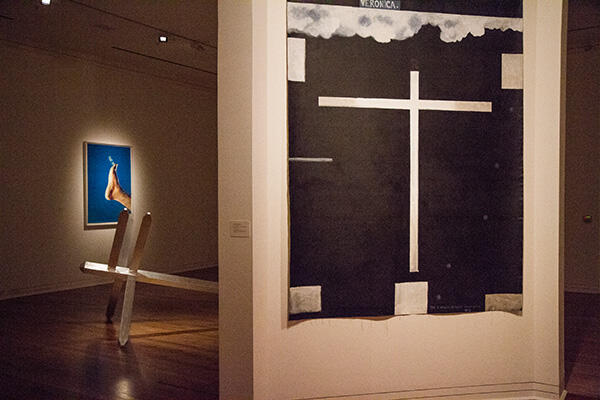
Dunedin Public Art Gallery Exhibited until 31 March 2015 The Dunedin Public Art Gallery’s Belonging displays a privately owned collection of works that features various artists (national and international) whose work is both bold and rich in religious references, symbolism and iconography, including the cross, crucifixion, angels, the bare foot (which is known as a sign of humility and respect) and the pieta (the Virgin Mary cradling the dead body of Jesus). Since the birth of Christ and the tales of his existence that have been told thereafter (those spiritual stories that comprise the fabric of all religions), people have expressed an inherent desire to belong or to be important to something; something greater than themselves. Belonging raises questions about the role of religion in modern life and how much faith we should really put in these material fabrications. The collection begins appropriately with Colin McCahon’s “The Five Wounds of Christ, No. 3” (1977-1978.) Centred in the blackness of the canvas, a white cruciform hovers and Christ’s body is assumed to be the form of the cross he died on. At the canvas edges, the five wounds he suffered are represented as angelic white light; ghostly apertures, small white windows on the surface that open into the blackness of the canvas. McCahon’s paintings are always rich in visual cues for its viewers, and here the central clue is the word “Veronica.” As Christ struggled toward the cross, a woman called Veronica wiped his face with her veil, which picked up a bloody imprint of Christ’s features. The story of Veronica’s veil was clearly an instructive one for McCahon, who wanted his paintings to do more than just illustrate the mystery of faith and resurrection. He wanted paintings like this to do what Veronica’s veil did – to offer a material trace of that mystery. Moreover, the black paint that covers the work contains the artist’s own handprints, as if he were pressing his own body against the surface of the work; metaphorically testing the depths of the darkness he has created. Like any other McCahon, its conceptual complexities lie in in its visual austerity. The next piece in the collection is Jacopo del Casentino’s “Two wings from a Tryptich” (c 1340-1350). Small in size, and executed in gold and tempera, the two-thirds altarpiece displays classic biblical imagery – most obviously the crucifixion of Christ on the left. Though the image on the lower right panel seems to be the most curious to a modern viewer, which shows St Francis of Assisi receiving the stigmata – the wounds corresponding to those received by Christ on the cross. Francis was one of the most well known Christian saints who reputedly lived from 1182 to 1226. Born into a wealthy family, he renounced his former life after a series of revelations from God (… beautiful). The following piece is a photograph by Giovanni Intra, “X: Best After 33 AD,” (1993), which features what seems to be the foot of Christ in a contemporary medical perspective. After all, the artist’s intention was “to show what would happen if Christ turned up to the Auckland hospital.” The decaying foot is photographed against an antiseptic-blue background. Although the intention to reflect a morgue-type situation is clear enough, the image is just revolting and uncomfortable to look at, and for such reasons, I can’t help but feel it was at odds with the rest of the work displayed. There are numerous sketches and engravings, which follow on the next wall, including pieces such as Lucas Van Leyden’s “The Crucifixtion” (1517) and Annibale Garracci’s “Pieta” (1597). Finally, tipped onto the centre of the gallery floor, is “The Deposition” (2002) by John Reynolds, a large polished aluminium sculpture in the shape of, what appears to be, a signpost. The sculpture carries no words or imagery, and completely surrenders the upright authority we expect of any sign. Reynolds seems to be laying his own cross-like signpost motif to rest, and in the process extending his career-long conversation with New Zealand’s most famous painter of crucifixions and Christian imagery, Colin McCahon. With its nameless surfaces, Reynolds’ “Deposition” pointedly declines to give visual aids as McCahon’s work does. The sculpture is, instead, literally and metaphorically reflective – a place to pause and consider the meaning of whatever journey we have just completed. Similar to the other works displayed in the collection, the act of looking in such an instance becomes an act of faith.
-
Culture
 Issue 11 11/05/2014
The Cubic Structural Evolution Project
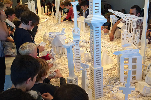
Dunedin Public Art Gallery Exhibited until 3 august 2014 Everything is so much better when you can touch it. I’m really enjoying the participatory installations that have been at the Dunedin Public Art Gallery recently. Playing with Seung Yul Oh’s “Oddooki” (those performance sculptures that rocked, chimed and looked like Angry Birds) was the highlight of my DPAG month in March, and this month it’s Olafur Eliasson’s The Cubic Structural Evolution Project. Olafur Eliasson was born in Copenhagen, Denmark in 1967 where he studied at the Danish Academy of Art from 1989 to 1995. For many projects Eliasson works collaboratively with specialists in various fields. Among them are the architects Thorsteinn and Sebastian Behmann (both of whom are frequent collaborators), author Svend Age Madsen (The Blind Pavilion), landscape architect Gunther Vogt (The Mediated Motion), architecture theorist Cedric Price, and architect Kjetil Thorsen (Serpentine Gallery Pavilion, 2007). Eliasson has also engaged internationally in a number of projects in public space, including: the intervention Green river, carried out in various cities between 1998 and 2001; the aforementioned Serpentine Gallery Pavilion with Thorsen, a temporary pavilion that was in London in 2007; and New York City Waterfalls in 2008, which was, indeed, in NYC and involved making honest-to-god waterfalls in different locations city-wide. He also was commissioned for a Louis Vuitton window campaign entitled, “Eye See You,” in 2006, which was a light installation displayed for a short duration in the windows of the 350 Louis Vuitton stores worldwide. He even has a profile on the “Friends of the Haus” section of their website. He’s well established. In 1995 Olafur established Studio Olafur Eliasson in Berlin, which is a laboratory for spatial research. Today Studio Olafur Eliasson employs a team of architects, engineers, craftsmen, and assistants who work together to conceptualise, test, engineer, and construct installations, sculptures, large-scale projects, and commissions, including The Cubic Structural Evolution Project. The Cubic Structural Evolution Project consists of 150,000 white Lego pieces on a table, with which the public is meant to create a miniature cityscape. In the same way that ideas from the audience transform the plastic Lego bricks into “art,” the exhibition itself becomes about the people who actually construct it. Sometimes a person would begin with nothing and, on other occasions, with a partly constructed piece of architecture left by the last participant. From a pile of white plastic mess emerged everything from pixelated looking models of famous architectural monuments (the Eiffel tower was, of course, constructed about five times) to modern skyscrapers, and other weird/futurist looking imaginings. As a whole it presents a complex illustration of how people perceive the urban material of the city. As much as I wanted to leave some monumental mark on the table, I left most of the constructing to the influx of children – who, surprisingly, seemed to be more architecturally advanced than myself. Building, creating, pushing, moving and tearing down, then reconstructing, the pieces of Lego, their elaborate towers were way cooler than my six-piece contribution! However, as the installation highlights, building a stable society is only possible with the involvement and co-operation of each individual. It’s a great piece of work and an interesting concept – and it’s all done without any colour. It is well worth going to.
-
Culture
 Issue 10 04/05/2014
For whom the wind blows
Brett McDowell Gallery Exhibited until 15 May 2014 “At art school we learned discipline, based upon constant immersion regarding things visual. We wanted to ‘know’ beyond social intercourse ... Art school really was the foundation of everything that has happened to me after I graduated in 1966. Any experiences before that simply defined what it was that I didn’t want to do.” Barry Cleavin is exhibiting at Brett McDowell with For Whom The Wind Blows and it’s reflective, intimate and disturbing. Born in Dunedin in 1939, the printmaker studied at Elam School of Fine Art between 1963 and 1966 before graduating with honours at the University of Canterbury, where he majored in painting. In his later years, between 1978 and 1990, Cleavin was a senior lecturer in printmaking at the University of Canterbury School of Art, and has since been the recipient of various awards, including a Fulbright Fellowship in 1983 to work at the Tamarind Institute, Albuquerque University of New Mexico. He was also awarded the New Zealand Order of Merit in 2001. Widely regarded as one of New Zealand’s most important and influential printmakers, he has received both national and international recognition for his work. Although Cleavin is one of New Zealand’s most collectible printmakers, his work remains affordable and attainable. With a $600–900 price tag per piece, Cleavin effectively brings his work and ideas to a wider audience (i.e. the less financially-elite demographic, composed of people like me, who spend exorbitant amounts of money on expensive art – not to mention the accompanying criticism, which general comes in the form of expensive art books). Fellow fine arts graduate of the University of Canterbury, author and art critic Pat Unger noted that, “Unlike Duchamp who explored a private experience in riddles, chances and anti-art objects, Cleavin communicates more widely; he exposes the follies, the vices and the ‘boutique fripperies’ of art and of contemporary life with easily available and elegant imagery.” Cleavin has for many years observed and dissected the polarities of human existence, culminating in often sardonic and disturbing images which challenge the absurd ways in which humans interact with their own, and other, species. It is Cleavin’s contemplation of such destructive interactions that’s imbued in the range of works within this exhibition. For Whom The Wind Blows presents a nostalgic retrospect of work, featuring an accumulation of drawings and etchings that date back to as early as the 1940s and as late as the early 2000s. A lot of the work derives from anatomical contexts. For decades, bones and skeletons have fascinated Cleavin. In a series of works from the mid-1990s entitled Hungry Sheep, he etched depictions of a ram’s skull he found on a beach at Moeraki, where he has a holiday house. Cleavin commented on this work at the time, saying, “bones are not inert dead things – they just happen to be extremely beautiful. Bird skulls I just love.” In For Whom the Wind Blows you get lost in the sparse, tight and formal lines of the carefully constructed skeletons of native New Zealand species. Cleavin uses his labour-intensive and age-old techniques of etching and painting to produce works of delicate precision and incisiveness. His drawing and technical skills are outstanding and, driven by an “assiduously acidic” mind, and a technical ability that dissects the shape of things with extraordinary proficiency, he has produced a spectacular body of work that oscillates between more and less vitriolic commentary. As a master maker of etchings, aquatints, engravings and lithographs (although his most recent images have been digitally rendered), in a combination of figurative, surreal, and cryptic imagery, the exhibition exposes his individual commentary on the seemingly deteriorating world around us.
-
Culture
 Issue 9 27/04/2014
Stretching Time
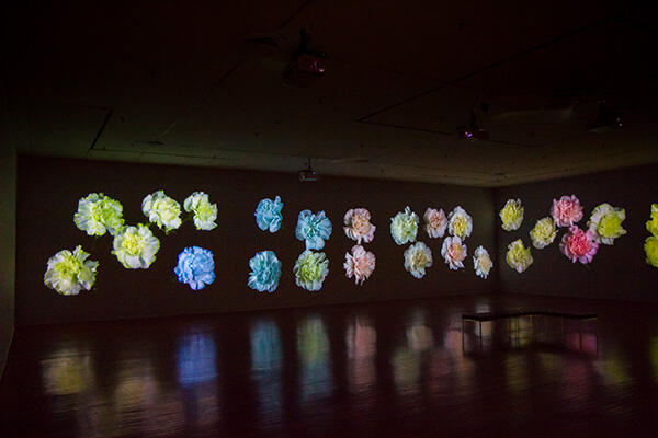
Dunedin Public Art Gallery Exhibited until 15 June 2014 Auckland based artist Steve Carr is currently exhibiting a new series of work at the Dunedin Public Art Gallery as a result of his ten-week residency under the Gallery’s Visiting Programme. Carr was awarded the 2013 Dunedin Public Art Gallery Residency, the New Zealand Creative New Zealand Grant and the Headlands Residency at the Headlands Centre of Art in San Francisco, USA. Steve Carr was born in New Zealand in 1976, and completed his Masters at Elam School of Fine Arts under renowned contemporary New Zealand artist, Michael Parekowhai, whose work also stems from complex production processes, functioning in the realm of the “spectacular.” His work has been in many major national and international exhibitions, which most recently includes Videos of New Zealand, a touring exhibition through New Zealand, Germany and Denmark. In 2011 Carr participated in the Rencontres Internationales, at the Centre Pompidou in Paris. He also represented New Zealand at the Busan Biennale, Metropolitan Art Museum, South Korea in 2006. And in 2010 he was the recipient of the Sapporo Artist in Residence in Japan. Carr’s work is held in a number of significant public and private collections throughout Australasia and further abroad. Carr’s new series, Stretching Time, is an immersive and engaging installation that plays with spectacle; metaphorically, and literately, “stretching time.” Carr’s work allows for a slowing of spectacle, giving the viewer more time to explore and expand upon it through the subtle utilisation of time lapse techniques, focusing in and out on a series of singular forms creating the charming and elicit spectacle that is Stretching Time. Range, the opening piece, brings together a collection of unique golf balls that were prototyped in 2013 for release this year. The golf balls were tested and designed for the current top tier of international golf players and the opportunity arose for Carr to make an artwork out of them when he was on the Headlands Artist in Residence Programme in San Francisco, which immediately preceded his time in Dunedin. The presentation of golf balls is situated on the wall of the lobby in which the exhibition opens, and it shows a series of coloured discs, which (I failed to realise this until I actually looked a bit closer) are the inside of the golf balls. They are artfully displayed in symmetrical rows, which make up the rectangle of empty space and small coloured circles, which have been described as “a scientific chart that punctures the optical field. It’s an interesting concept, an intriguing display and a delicate entrée to the optical expanse of the second part of the exhibition, Transpiration (2014), undoubtedly the most visually immersive part of the show. Transpiration literally and metaphorically slows down the process of time though Carr’s cinematic rendering and the elaborately constructed elements of mise-en-scene that enhance the act of spectating. In this screening, Carr captivates the viewer through his repeating and sequencing of the manicured carnation arrangements, which are projected thirty metres across the walls of the gallery space. The sequence is equally as overwhelming as it is contemplative, as Carr brings the viewer’s attention to the fact that, although the technical process of the piece is somewhat simple, the optical result is expansive and intense. Carr delightfully transforms the common object, a carnation flower, into a charming, sensual and highly charged still life spectacle. You are able to loose yourself in the moments of detail that are revealed through this process of “stretched time” – such distilled details that are otherwise lost in the process of real life time, which is often fast-paced, stressful and somewhat disengaged. As Carr notes, the idea of “stretching time is important in a physical and personal way, because I want people to be aware, even before they see the show, that this is as much an exercise in relaxing as it is in sinking into a cinematic experience of the effects of time.” Disregarding all this extra biographical and conceptual information about the show, overall, it was just really nice to be in an empty dark gallery space, subtly illuminated by projected images of pretty pastel coloured carnations on the wall. A brilliant and beautiful spectacle that you all must see – I want one on the wall in my apartment!
-
Culture
 Issue 8 13/04/2014
Exorcise (E)
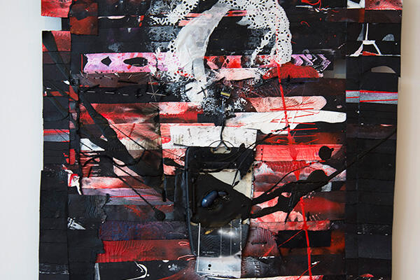
Mint Gallery Exhibited until 18 April Mint Gallery is currently exhibiting EXORCISE (E) by award-winning artist James Robinson. Robinson was born in Christchurch in 1972 and currently lives in Dunedin. He completed a Bachelor Of Fine Arts at the Otago School of Fine Arts in 2000, and a Foundation In Fine Art at Nelson Polytechnic in 1990. Since then, Robinson has exhibited regularly in private and public galleries both Nationally and Internationally and his work is held in numerous public, private and corporate collections throughout New Zealand and Australia. Working as the William Hodges Fellow in Invercargill over the past year (which also resulted in a six-month New York residency), James has created drawings, paintings and collages in a methodical large series across a broad range of mixed media and technique as seen in EXORCISE (E). Robinson’s works in the past deal with trauma and elevated levels of emotion, and his most recent work exhibits the same level of refined skill application, as each work leaves some kind of stain in one way or another. In his previous exhibition, Astral Weeks, exhibited last June, Robinson questions the crucial questions of life, existence and meaning, presenting his wonders in images of crystal skulls, pagan symbols, sci-fi images and obscure annotations which hint to his own uncertainty and misunderstanding. Similarly, in EXORCISE (E), we see a range of stylistic innovations and obscure annotations. Robinson is clearly motivated by the complexities of his own intellect and life in the creative sphere, and his works seem to offer a balance between the conscious and unconscious; and the material and immaterial world. The anxiety and doubt of the modern world is revealed through the flurry of brightness and brilliance of his work, but it is disrupted by an insistent nagging commentary of constant uncertainty and questioning – i.e. the cynical annotations which ask the big questions, “why do I exist?” and “what does all this mean?” Robinson does not necessarily provide these answers and it is unclear which side he falls on or whether he has decided for himself. The works are sincere, but not definite. Robinson says, “In the end, I don’t know if the works are meaningful or not ... whether there is ‘meaning’ or not at all ... it’s a kind of back and forth, an argument, but it’s a process that I need to be with right now.” Robinson describes this body of work as a continuation of his New York series, integrating the nature of identity and globalism and what it means to be human in an increasingly inhuman world. Also inspired by nature and music, sex and movies, the works are described in the artist’s statement as “the horror of human evil and degradation on most fronts ... The failure by design implemented by our masters for want of a better definition … Covert, totalitarian, spiritual enslavement via self administered mind control surveillance, police-state of the planet and all them other silly irrational trifling paranoias I have as one of the mentally ill bio-chemical consumers gone faulty for some reason.” The series is in close dialogue with Robinson’s on-going spiritual investigation between the more primal Eastern ideas of the mind and body, against the Western cultural values of materialism. The surfaces are built up through various layers and processes of icons, texts and found materials, including string woven sacks, bottle caps, newspaper pages, straws and even HAIR. Using a variety of brightly coloured wet media, including pastel acrylic colours and water colour variations – as well as the blank areas of untouched surface, which reveal gaping holes or burnt, stitched and ripped out areas of inverted eruption – the paintings become a physical experience in themselves. Not only is there a strong sense of the artist’s actions in what is seen, the surface is so varied, pitted and textually excessive, there is visual complexity that one must weave in and out of in order to be able to take everything in. The agitation and anxiety of the artist is inherent, and this self-investigative oscillating work reveals the journey of the tortured soul within. Robinson invites the viewer to participate in the search as we trawl through his trivial statements, symbolic forms and weird surreal vistas, trying to decipher any meaning. I couldn’t help but think there is no real meaning, and perhaps the works are just a manifestation of Robinson’s personal experiences, emotions and thought processes, recorded at the times in which they were felt.
-
Culture
 Issue 6 30/03/2014
Richie Boyens - Clothes I've Made
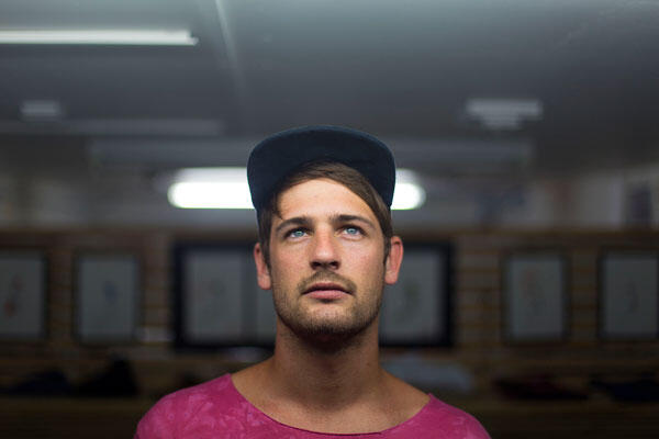
Last week i met with Richie Boyens, a Dunedin-based designer who started the brand Clothes I’ve Made, which is being shown in the capsule collection at iD. With Richie’s ambiguous design choices, combined with the use of various floral, striped, paint-speckled and tie-dyed fabrics, and his latest intention to reinvent the puffer jacket (about time someone did this) somehow his collection is coherent, structurally flawless and completely wearable. Not really a typical designer, having had no institutional fashion education or qualification, Richie’s story is fascinating and awesome. Born and raised in Hawkes Bay, Richie then spent some time in Wellington (getting inspired and not going to University), before moving to Dunedin six years ago to start what is now a creative, collaborative, and totally progressive brand. I was initially going to do a really constructed interview over coffee at a café or something, but when I found out Richie had a studio space opposite my apartment, I naturally assumed it would be more appropriate to go there instead. I didn’t really know what to expect out of a designer’s studio because I’ve only really spent time in artist studios, but it was by far one of the coolest studio spaces I’ve been into. There was art on almost every wall – rolls of material, couches, half a mannequin, a shaky worktable, an old sewing machine, and there was even a piano; it was literally like walking into a saloon-style studio (featuring fashion) and I totally never wanted to leave. He was cool, the interview was fun, his studio is insane and his work is a creative mind blow-up of mad design skills and cool images. How did CIM start? Give me all the raw details! Well ... I’d been working at Void for a while and then, when I moved to Wellington, I did a couple of years at Levi’s. I never went to Uni, there was too much shit to do in Wellington. Then I started working at a café, paying for all my sewing stuff, and I kept seeing everyone wearing the same clothes and it was just annoying. So I lived with another designer in Wellington and he was cool, and his work was cool, so I moved back down here and picked up Mum’s sewing machine and just started going for it. I really like your studio space, there’s heaps of weird and cool and interesting things in here. That half mannequin in ripped jeans in the corner – can you elaborate? Yeah, I made those pants in October 2010. They were the first pair I made. I didn’t have an over locker and I just wanted some cool pants. It was literally like ... Mum’s sewing machine, typically excited male ... rushed in with material, cut it out using Vivids, pretty much broke every rule in the sewing handbook, if there is one; then started attacking them trying to figure out how to hide seams without the over-locker. Yeah ... I quickly realised the extent of my skills weren’t as adept as I had hoped they were, and when I put them on (they were almost finished) I put an elastic band on them, and the crotch was all wrong and inverted and too low and I walked like a fucking duck. But, as it turned out, that disaster turned into a passion to go harder ... Most NZ designers are based in Auckland or Wellington. Do you think that being based in Dunedin has an impact on the way you design or the way you run CIM? In terms of fashion in Dunedin, it rules and it’s changing all the time and I’m just doing it my own way. I’m really inspired by my environment, though. Environment is definitely influential. If I go somewhere like Invercargill I’m probably not going to wear these floral silk pants. Can you tell us a little bit about the signature of CIM. Do you have a certain customer or character in mind when you put together the collection or do you design for yourself? I started making clothes for me so all the sizing is real different from universal sizing, it’s a lot more tailored. Yeah, up until now, it’s been totally motivated by my friends and the people I hang out with, but it’s kind of cool when random people just come into the studio and ask for something off the bat. Describe the general process you go through to design and realise a piece of clothing? We’ll just sit down and have a discussion and decide what fabrics we’re going to use, discuss an idea type-of-thing. When I have an idea it’s like a little explosion and then I just sort of pick parts of it to pull it back together the way I want. I don’t stick to any design process ... I just create a general process of thought. What artists did you draw your inspiration from, for the iD collection? Jarrod McHutcheon, Ben Edwards – basically everyone on these walls. It’s so cool because each style is all street art and the colour palates are often quite similar to our clothes. As art, it describes something totally different than it would as an article of clothing. Mondrian was a big inspiration, too, I think. I fucking love Mondrian. How did you transfer your inspirations into your designs? Colour palate was a big one. And symmetry – it has to look good on every angle. It’s like playing with Lego, trying to piece it all together to make on time. What can people expect to see from you further into this season? Hip-hop, design, ‘80s and ‘90s colour. My designs came from when I was a kid. PVC jackets, stripes on your sleeves, it’s just a full expression of who I am – it’s a structured set and I’m pretty stoked about it. What is your view on the symbiotic relationship between fashion and art? Fashion and art – that’s a hard one. If someone’s like, that’s a cool painting, I’d love to have it on a top, but that’ll never happen; fashion allows you to do that. But I also think people can always hang their paintings on the wall, and in a museum – as “art.” But as soon as you put it in public sphere, it becomes fashion or a trend. Fine art influences fashion, but fashion is far more physical than art. Art is more emotionally invested, I think. I don’t know. It all just looks good. Eco-fashion is a thing this year at iD. What do you think of eco-fashion? Eco and fashion don’t go hand in hand because of the way the fabric is made. They pick cotton for ridiculously cheap and it goes into this massive chemical process where the organic cotton is sprayed with herbs and pesticides, and it’s just not good for the final look of the garment. Sometimes it looks stiff. But it’s awesome that there are still designers that go to that extent to keep things environmentally friendly. What do you think makes a quality article of clothing? I’m into using fabrics that are locally made. If I was going to use leather, or something, it’s cool to be able to say its made in New Zealand. The wool we’re using now is yarned by my old boss. It smells like it would on the sheep. Why don’t people appreciate the detail, design and quality of high-end fashion? I think it comes down to who you are as a person – you can’t really generalise that kind of thing. Some people aren’t educated in fashion, per se, and some people just aren’t interested ... If I told you I wanted you to make me something, would you? I’d say “yes,” because I like a challenge. The most challenging thing is about getting over how the other person will think. But you have to just trust your own judgment. What do you wish people would understand about working in the fashion industry? For me, the whole fact that I have done this on my own has been one of the best things for me as a person. I was always stubborn as fuck, and I still am. But I’ve learnt so much. Important things like how relationships need to be – friends and business ones – and just not feel ashamed or scared to express who you are. That sounds really cheesy but it’s so true. Knowing I have support from other people has been huge. I really appreciate all the help I’ve had. The people we have met and dealt with could not have been more inviting and helpful. I’ve also learnt a lot about myself by putting myself on the ledge. I’m so happy doing this and I put every cent into it. I’m kind of poor, but I fucking love what I do. You have to be careful not to jump into something without the right intentions otherwise it’s so transparent. I don’t know if it’s a bad thing or a good thing. Fashion’s weird, I’ve noticed that once it gets past the design it goes into this mad media frenzy and the perception of success kind of changes. If you’re just printing your artwork on t-shirts to make money that’s fine, and that might make certain people happy, but that doesn’t make us happy. It’s just about finding a good balance and a way to do what you love at the same time. People need to appreciate the work people do and the craft of it.
-
Culture
 Issue 5 23/03/2014
Interview: Marie Strauss
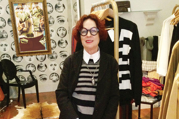
I’ve realised, in the midst of my daily routines, that there seems to be this generalised idea that art and fashion coexist, and it has left me wondering – with fashion becoming the focus of an increasing number of exhibitions and shows (i.e. iD Fashion Week), is the distinct line that once separated fashion and art becoming completely blurred? A handful of notable designers throughout history have stated unequivocally that fashion is art but in contemporary culture, the topic continues to be debated and designers, as well as art and fashion historians, remain divided. The other day I went into Dada, the small boutique store directly beneath my apartment, and talked to Marie Strauss – owner, designer, curator, world traveller, and fellow art enthusiast, for at least an hour. Really, all we needed was coffee and cake. Strauss started the Dada Vintage label in 2008 when she also opened the Dada boutique store on Moray Place. In a completely non-ostentatious location, Dada is squeezed in between Mint Gallery and the Moray Place florist. Marie’s personal taste is reflected in both the store – which is filled exclusively with racks of very well designed and made clothing – and in the front window, which artfully displays hand made popcorn sculptures, painted ceramic cat figures, dada-doll mannequins draped in vibrantly patterned silk fabrics and Kate Sylvester cashmere cardigans. Typically dressed in a Christian La Croix-esque outfit (red nails, costume jewellery and shiny shoes), with Vivienne Westwood-chic (but short) hair, Marie stands alone behind her small counter top, which is elaborately decorated with numerous piles of jewellery, books and fabric swatches. Her presence alone totally adds to the already distinctively quirky, but still à la mode, aesthetic. The store, and Marie’s own designs are eclectic, colourful and theatrical, but remain understated, edgy and, above all, tasteful and refined. Holding a degree in drama, two master's degrees in fine arts, a postgraduate diploma in costume design and an honours degree in ceramics, Marie’s artistic flare and extensive knowledge of the arts and fashion is clearly manifested in her store, and her designs, which seamlessly display a sound knowledge and profound understanding of style and quality combined with influences drawn from classic couture, contemporary art and architecture, as well as the European avant-garde and Dada period. In case you’re confused about the term “Dada” and its overall significance, Dada is the name given to an art movement that started in Germany in the 1920’s. The movement primarily involved visual arts, literature, poetry, art manifestos, art theory, theatre, and design, and concentrated anti-war politics through a rejection of the prevailing standards in art, through anti-art works. In addition to being anti-war, Dada was also anti-bourgeois and had political affinities with the radical left. Hannah Hoch, the pioneering female Dadaist, sardonically critiqued the mass culture beauty industry of the time in her work, and equated women's liberation with social and political revolution. Dada laid the foundation for abstract art, a starting point for performance art, and a prelude to postmodernism; it was an influence on pop art, a celebration of anti-art, and the movement that opened the door for Surrealism. With iD Fashion Week fast approaching, I caught up with Marie for a fascinating conversation. Hi, Marie. I’m so pleased to get a chance to talk to you! This store is so great. How long have you been here for? For about seven years or so! I used to teach at the art school, but I have had numerous businesses. I had a furniture design store, interior decorating, and then a t-shirt design business called Strousse. I was also in partnership with a graphic designer once. He was really great. Did you name and decorate the store yourself? I love the window display! Dada is obviously named after the movement. The Dada dolls in the window are taken from the Dada period. Hannah Hoch is a really big inspiration of mine as well. Dada apparently means “hobby horse,” so I have a carousel horse behind the counter there. Well, it’s a framed photograph of one. The store is really personal for me, it’s like a studio; I can exhibit whatever I want here. Art, pots. Anything. It allows for me to be very inventive. Tell me a little about yourself. Where are you from? What's your educational background? What are your general professional and non-professional interests? I completed a BA in drama and costume design in South Africa, then an MFA in Johannesburg, and then I did ceramics in my honours year before getting my second MFA. I consider myself to be a maker, though – not an artist or designer, or anything my qualifications say I am. I just make things. I started the business with someone else and it was a disaster. I’m too opinionated to work with anyone. I have a friend who is a designer, she lives in Auckland and she’s the only person I could work with because our taste is the same. The shop is the manifestation of my own vision and it’s precious to me. It’s my aesthetic. What I choose from other designers has to match my own designs and my own taste. It’s very personally invested. Who are some of your favourite designers? Artists? My favourite Italian label is Marnie and, of course, Prada; Walter van Beirendonck, older designers as well – Balenciaga, Valentino. The best designers’ clothes are always wearable. With fashion becoming the focus of an increasing number of museum exhibitions and a multitude of artists now collaborating with high end/designer labels, the distinct line that once separated fashion and art is more blurred. What is your view on the coexistence of fashion and art? I think it should be a very clear line otherwise it becomes de-crafting. Fashion exists in the same way Pollock’s paintings do – it’s the craft of it. Fashion is not fine art; fine art is the influence of fashion. Clothing on a catwalk is an occasion for display. It’s very theatrical, but that doesn’t make it art, or the clothes art, because with fashion, nothing is new, it’s all regenerated and in a framework that is relevant to the time. I just find it astonishing in fashion that people blur the line between fashion and art. Just because fashion is fleeting and art is forever, it doesn’t mean that fashion has to be less, or has to be defined by existing as art. It is its own thing. Fashion is just superficial fun; it feeds an ego – it’s about presentation of the self. In saying that, however, you are what you wear, but in a lot of ways you aren’t what you design. If you hang art on your walls people will judge you by that, whereas with fashion, it’s changing every day, and you can throw it away if you don’t like it. What do you think makes a quality article of clothing? Only three things: fabric, design, and craftsmanship. Beautiful fabric, which is beautifully designed and beautifully made, is all one needs. Good quality clothing just hangs better, looks better and is better. There’s this odd confusion where people buy things that cost less thinking that it’s the same. You can buy a look for very little, but you can’t buy quality. And quality is made to last – like the lifetime of a classic silhouette. Why don’t people appreciate the detail, design and quality of high-end fashion? They have no expectation of it, so they don’t look for it. I agree. Can you describe the general process you go through to design and realise a piece of clothing? A lot of clothing brands want to make multiples of things so you have to go to production, but I only want to make clothing for myself, and my own store. I prefer exclusivity. I just design my own clothes and make them, then sell them. How would you define Dunedin’s fashion? Because I look for my fashion elsewhere, and I’m not from Dunedin, I was never influenced by Dunedin fashion, so I am relatively unfamiliar. But that’s not saying I don’t think it’s important, I just have no knowledge of it. The only time I ever see Dunedin designer’s clothing is in iD. I know Dunedin is seen as a fashion hub; I just don’t keep up with it. My influences are European art and architecture and fashion – I live on a farm, I’m not socially involved. Fashion for me is like painting, or making a meal or creating a pot – to me it’s all the same. My taste is eclectic – I collaborate with people who want to make things happen because they find it exciting, not to follow some current trend. It’s not a sound business attitude, but at the end of the day I’d rather do this than not. A lot of people want to be something or be defined by what they do or create and I just don’t think it’s important. Let’s talk about iD. How long have you been involved with iD for? This is my fifth year at iD, and the third year that I am doing the 15-year collection. It’s the same size as Plume and my disorganisation is quite overwhelming! What’s it like preparing for such a big show – especially this year, because of the anniversary – can you explain the process? I treat it like a project or a proposal. I get my ideas in book form with swatches and drawings and photos and I work from what seems to be a storyline. It makes sense for me to do it like that, a lot of designers do. It also forces me to get things made for the season. It’s a pity there’s no iD before summer. Where did you draw your inspiration for the iD collection? Well, the theme is taking a dog for a walk in France. It sounds very banal but the way the French dress when they take their dogs for walks is fabulous. The coats they wear, the forms of those coats are so beautiful. There is a real emphasis on looking respectable and the small detail of things is inspiring. The way bread is wrapped perfectly and the feel of beautiful fabric is inspiring. What makes life refined is inspiring. Lining is the right lining. The joy is in the small things. I also love the French 18th Century. I love Milan, I love it a lot and I know it quite well. I go to Europe twice a year and when I’m in Milan I go for walks in the morning before the sun comes up and the light falling on the churches is unforgettable. French culture really is the pinnacle of high culture. Garnier is wonderful, too. There’s a French saying, “To dress badly is offensive to other people …” How did you transfer your inspirations into your designs? This year’s collection, as I said, is inspired by form, colour and patterns, with a mix of fabric, textile and fur to strengthen the silhouette. It is all about energy and light-hearted fun, form, theatre and humour and it comprises mainly of one-off pieces. I look forward to seeing the show and your collection! Thank you for talking to me, Marie; it’s been inspiring, interesting, and fun. And I want to buy one of those popcorn sculptures, so let’s exchange emails. With that, we exchanged email addresses, and I left the store. While a definitive answer to my initial question may not have been answered, the tug of war between fashion and art will certainly persist. Perhaps it’s just best to think of art and fashion as having a symbiotic relationship as two different entities that feed off of one another.
-
CultureIssue 4 16/03/2014
Pearler
“I am an Expressionist painter. I rarely plan a painting or do preparatory drawing. I commence the work with a quick wash of strong, primary colour and then begin to hurriedly paint figures of people, animals and hybrid creatures. I add crude marks for volcanoes, hills, sea, buildings, boats, clouds, sun and moon, working with vibrant impasto. The painting forms, and informs me as to what it is. The last stroke is always the title. Above all I prize spontaneity, colour and a good dose of irony. I love being a painter.” - Ewan McDougall Ewan McDougall is a Wellington-born artist who is based in Dunedin. He was educated in Oamaru, where the North Otago painter Colin Wheeler taught him painting. From there, Ewan attended the University of Otago, gaining an honours degree in Political Studies in 1971, before working as a junior lecturer and tutor at the University. After his time at the University, like most other “artists,” he took some time off to travel and to experience. During the 1980s he travelled extensively, working numerous jobs here and there at pubs, fast food places, mines and on oil rigs (so bohemian), before finally moving home to New Zealand with his partner, Sarah McDougall. In 1988, he was referred to Queen Mary Hospital in Hamner Springs for treatment for addiction, a time that subsequently provided much inspiration for his earlier, and later, work. He began painting during his rehabilitation and developed a dynamic personal style using thick, richly pigmented oil colours, inhabited by personal references to his outrageous and somewhat volatile lifestyle; a style that continued on into his later work, as displayed in Pearler. McDougall has been painting full time since 1988 and has had 64 solo exhibitions in New Zealand regional galleries, dealer galleries and numerous group exhibitions – as well as exhibiting internationally. He is a figurative neo-expressionist, and using various brushes, knives, and his fingers in his studio, he creates works of wild excess, vigour and ecstasy with oils that are scraped, squeezed and splattered on to canvas, manifesting images of the memories that permeate his mind. There is a certain element of warmth in his passive-aggressive spontaneity that remains unforgettable, and above all there is a delicate sense of honesty, reflection and self-deprecating humour present in all of his works. Pearler, an exhibition and book of paintings and poems which celebrate the 30-year wedding anniversary – the Pearl Anniversary – of Ewan and Sarah McDougall and their creative life together; they collaborate to recount their past 30 years together. The exhibition and limited edition book is composed of seven poems to which Ewan has responded in paint, followed by eight of Ewan’s paintings, to which Sarah has responded with poems. Paintings with titles like “Happiness Junky” and “Bad Mona Lisa,” which feature childlike figures floating in empty spaces of vibrant colour, encapsulate the wild freedom that exists in their shared intimacy. McDougall states in his introduction to the book, “many of the themes and paintings owe a great deal to the fun, frivolity, chaos and pain of the past, as well as what I think of as the redemption. I am now free of mind-altering substances and today my mind is free to alter the world.” Art writer David Eggleston comments, “His wild-looking, clown like figures, swollen lips and squashed boxers’ noses, painted viscerally and set adrift to bob and weave in eerie landscapes.” McDougall’s bold and cavorting figures; scrawny-armed dancing stickmen grinning under the sun with candy-striped guts and wide, red eyes, leave an indelible impression of careless drinking, drug fuelled fun and delightfully undignified oblivion; a familiar state for most. I was inspired.
-
Culture
 Issue 3 09/03/2014
Interview: Rupert Smiles
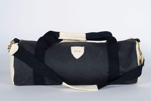
I have kind of been in this polygamous relationship with art and fashion for a few years now, so naturally I try to merge the two whenever I can. This week, I’ve had a really new and major obsession with handbags … as art. I simply can’t get past that moment when Kanye gave Kim a Hermes Birkin with a privately commissioned George Condo on the front; it gives me heart palpitations. I am one of those annoying people that insistently believe a bag is an essential item for any given occasion. I have numerous bags for the daytime, a bag or two for overnight, a bag for my make-up, a bag for my laptop, a bag for Uni, a bag to take to twenty-firsts, a bag for the rubbish in my car, and a few others that float around my apartment. I have so many bags I need a break. But like a good painting, a great burger, a perfect sculpture (or significant other?), a bag that makes you really happy is really hard to find. Yet, I have found one. Will Hyndman, University of Otago graduate, local designer and budding bagman – who you also might have seen selling stuff at Slick Willy’s – has come up with a classic duffel bag that can be used in every situation. Will has spent the past few months designing and hand sewing bags by himself in his basement. Inspired by vintage mountaineering, vintage skiing, exclusivity and the obvious travesty that is Country Road luggage, Will has created a range of bags (small, medium and large at this point) that are basic, black, leather, monogrammed, and totally baller. I stopped in for a quick juice and chat the other day with Will to get some moody and inspiring insights on his brand and bags. Here’s what he had to say: Your bags are beautiful! How would you describe them? Well, it’s really just a classic duffel bag that combines adventure with style, using waterproof canvas and New Zealand leather, with heavy hardware detailing. Ideal for guys at the gym and gals on the go! Where did the name “Rupert Smiles” come from? It’s a bit cute! Rupert is my middle name. And Smiles is my first love’s name – although she never really took the time to love me. Hopefully she likes the bags! How bittersweet. How do you make them; are they all hand made? HAND MADE! Yes. Blood, sweat and tears. At home, in the basement, no windows, concrete floor – cold feet. On a sewing machine. It all happens. That sounds … really raw. Why monogrammed? Yeah, the monograms are really just a point of difference. I guess it just makes them exclusive to each person. And it’s just real baller. I love having my shit monogrammed. It makes me feel important. In what instance has your Rupert Smiles bag been particularly great? It was real perfect to take to R&A because nothing important got wet … At the moment Will is reworking some vintage wetsuits, brought all the way from Cali, into some limited edition Rupert Smiles duffels – in colour! Breaking out. You can order and buy your Rupert Smiles bags online at www.slickwillys.co.nz or in store. And be sure to follow Rupert Smiles on Instagram @Williamrupertsmiles for updates and funny hashtags.


