
Charlotte Doyle
Art Editor 2013
Articles by Charlotte Doyle
17 articles found. Displaying page 1 of 2.
-
Culture
 Issue 26 06/10/2013
Let Us End With Some Porn
There is a deeply-felt anxiety, shared by many girls, about the need for a “perfect” vagina. For many, this necessitates spending 50 dollars on a braz or bikini wax (that will last less than a fortnight) in the hope of fulfilling the desires – or even expectations – of their male counterparts. Much of this is the result of pornography. Pornography has hijacked our mental images in many strange, and often-overlooked, ways. Consequently, the art world is beginning to explicitly tackle porn in an attempt to raise awareness about its influence on social relationships in the twenty-first century – such as our obsession with hairlessness – and force the topic into the conversation spotlight. In 2006, The Guardian published an article contending that artworks with pornographic themes were no longer shocking. The central argument was essentially “oh, porn is so mainstream. Move on, ‘art’; it’s time to head back to the studio. Your obsession with porn is starting to get boring.” Why, then, were Ed Templeton’s photos of teenagers kissing only exhibited last year? Why do pictures of – and even references to – vaginas continue to be the subject of such disgusted and dismissive reactions? Think about Terry Richardson’s collaboration with Miley Cyrus. Porn has subtly infiltrated our communities, and is making its presence felt through societal attitudes (and, as David Cameron has realised recently, through supposedly “cleared” Internet histories). And yet people continue to be shocked by it. A frank, open discussion about pornography is desperately called for, and art is playing a key role in sparking one. There is a strong connection between porn and art. Many artworks borrow from, or exploit, pornographic imagery. However, exhibitions explicitly about porn seem to be few and far between. A couple of weeks ago, my mother and I casually attended the opening of A Different View: Artists Address Pornography at the University of Auckland’s Gus Fisher gallery. Showcasing the work of 20 New Zealand artists, including Yvonne Todd, Reuben Paterson, John Pule and Dunedin’s very own Kushana Bush, the exhibition aims to reignite public debate around the pervasiveness of mainstream pornography in a society with a “prevailing atmosphere of tolerance and silence.” Debate was certainly ignited. Within 10 minutes, I found myself gesturing to Rohan Weallans’ painted, bejewelled and exposed female genitals and saying to Donough McWhannell (wife of Peter McWhallen, and subject of many of his paintings), “aren’t all these vaginas fantastic?” Her response: “oh I know! They make me just wanna … [waggles tongue].” The entire exchange, it must be remembered, took place within a beautiful white marble building on Shortland Street, in a room packed with people wearing expensive shoes and drinking pinot noir. The way art sparks conversation is truly a beautiful thing. Highly varied, the exhibition remarkably lacked any particular bias – the overarching tone was not strikingly feminist, misogynistic or homophobic. It also managed to address a number of important socio-political issues (and certainly challenged conservative conceptions of modesty) without pointedly attempting to categorise porn. By showcasing these works, Auckland University is engaging with one of a number of artistic projects aiming to lift the public taboo regarding pornography and move it out of the realm of art that is purely about asserting one’s right to freedom of expression. Much of the art on display does not slam porn as being “bad” or “damaging.” Instead, it pointedly questions porn’s trickle-on effects, which can sometimes border on the disturbing. Check out, for example, The Great Wall of Vagina, which confronts the audience with 400 plaster casts of female genitalia. Alternatively, try makelovenotporn.net. This is a forum in which people can submit their own “love” videos in celebration of the wonder of sex, and aims to demonstrate how little porn is representative of reality. It’s definitely NSFW, but it redefines sex as something that should be openly celebrated. After the opening, porn was the topic of conversation in my family. I’m proud of them for not seeing the topic as something to be avoided but rather questioned and openly discussed, and for recognising that it is a major – albeit hidden – factor in shaping our society’s values and perspectives. Art is penetrating the wall of social delusion when it comes to porn, and is helping us to celebrate sex for the wonderful thing it is.
-
Culture
 Issue 25 29/09/2013
The Deconstruction of a Gallery Opening’s Mystique
The Dunedin art “scene” is often considered to be “underground.” Seen as the realm of the city’s “alty” citizens, there is a widespread public perception that few students would go out of their way for an artistic experience. However, for the entirety of last week Dunedin art pervaded the student consciousness, spreading awareness and enjoyment in equal measure. OUSA Art Week is designed to expose students to the art world and provide them with opportunities to participate themselves, and “White Night” accomplished this with aplomb. Gallery openings can be as low-key as any movie, and yet many still hesitate at the thought of attending one. Perhaps this is because gallery openings can exude a sense of exclusivity, or because people are concerned that they will not be able to “talk the (art) talk.” The White Night Gallery Crawl, however, did away with such misconceptions, bringing people from diverse backgrounds together over glasses of (free) wine. Despite the distinct lack of cheese (which I’m told was a direct consequence of my being late), this relaxed gallery crawl successfully broke down students’ reservations, and will hopefully prove instrumental in prompting increased student attendance at such events in the future. Many of my flatmates asked me afterwards why I hadn’t made them go to openings before. White Night took me down alleyways I’ve had my eye on for years. The trail was brilliantly diverse, leading attendees from the Attic to the Dunedin Public Art Gallery, and then on to Allbell Chambers, Dowling Street and Moray Place. All in all, it transported me far away from the mundane realities of my day-to-day Dunedin existence. A highlight was being immersed in the Allbell Chambers. All three storeys of the studio-crammed building were open to the public. You could wander causally between the various rooms, each of which had its own special character. Alex Lovell-Smith’s photography studio stood out; professional, streamlined and stylish, it was jam-packed when my flatmate excitedly dragged me in to check out his “Swedish aesthetic.” Some attendees were more willing to explore Space 4 U (a gay/ bi sauna in Allbell Chambers) than others. One guy went so far as to write off painting as a “dead” medium, and everyone devoted different amounts of time to different spaces depending on their stylistic inclinations. The artworks I remember are the ones other people also pinpointed as their favourites. I’ve become accustomed to visiting galleries on my own this year, and thus to experiencing new art without the benefit of other opinions to balance my own. To spend a night wandering from gallery to gallery with a bunch of likeminded people, therefore, exposed to a range of opposing viewpoints, was a novel and highly enjoyable experience. As we were leaving Dowling Street studios, a friend expressed a renewed faith in Dunedin. Exploring so many hidden, creative places made us all fall in love with the city just a little bit more. I’ve focused on the gallery crawl because it was a dynamic event that appealed to many people who hadn’t previously had the confidence to enjoy art in a social capacity. Opening people up to art’s addictive properties was Art Week’s real success.
-
Culture
 Issue 23 15/09/2013
Blue Oyster
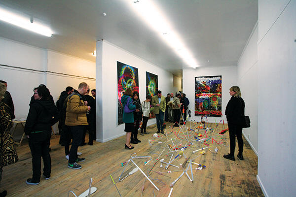
Blue Oyster is the hipster gallery of the Dunedin art scene. Bound to provide you with an interesting glimpse into local contemporary art, it has until now been somewhat of a hidden gem, tucked down an alleyway on Moray Place. However, it recently underwent a transformation, and on 30 August hosted a packed opening function to showcase its brand spanking new space. With its first exhibition featuring a prominent New Zealand artist, the move marks a new era of elevated professionalism for this edgy gallery. Established in 1999, the Blue Oyster Art Project Space is a programme that fosters contemporary and experimental art practice within Dunedin. Designed to “broaden interest [in] and understanding of contemporary art,” the space affords artists the freedom to experiment fully, and remains strictly not-for-profit, going so far as to reject outright any clearly commercial projects. The new gallery also has a designated room at the back for research, and in the past has held many panel discussions over artistic items of interest. Blue Oyster is therefore a novel concept, extending the notion of a gallery beyond being a place that promotes and sells art. Blue Oyster used to be underground, literally as well as figuratively. While being located down an alleyway is an interesting feature, it had the unfortunate consequence of depriving the gallery of any natural light. The gallery’s new space, entirely fronted by a full-glass window, is thus a dramatic improvement; not only is it flooded with light that doesn’t come from a dangling fluorescent bulb, it now attracts an unprecedented amount of foot traffic. During the 10 minutes I was there, about three groups of people stopped walking to look through the window. Perhaps the next challenge should be making the entrance more welcoming, so that anyone feels comfortable walking through the door. In saying that, however, the window does provide enough of a glimpse that being in the room may not even be necessary. Judy Darragh has the honour of being the first artist to display work at Blue Oyster. Pinewood Bend 2013 consists of twisted pieces of metal composed along the middle of the not-yet-varnished floor, garnished with pieces of fluorescent tape and spray paint, the tips bandaged with fabric and pieces of foam. It manages to exude a sense of simultaneous density and flimsiness. Referencing the progression of life, it evolves both in colour and in scope: neutral colours become bright neons, and the low-lying metal structure becomes tall spikes sporting various shoe insoles. The work stays true to her distinctive kitsch style, but while a crowded room never works in an artwork’s favour, many people I’ve spoken to who attended the opening were more impressed by the galactic adaptions of Denzel Washington movie posters with neon spray paint. The continuity of both theme and style across the various works, however, combined with a clear attention to detail, made the exhibition more powerful than second-hand descriptions had led me to believe. Located right next door to Les Mills, not only does Blue Oyster offer fitness buffs a taste of art alongside their workout, it makes the entire street the art hub of the city. Next to Milford Galleries and up the road from Brett McDowell (two galleries known for their vibrant openings), the Dunedin art scene is increasingly becoming a real community. The gallery isn’t even finished yet, and there is plenty of exiting potential yet to be realised. Darrah’s bright works are an appropriate reflection of the thought-provoking art to come, and perfectly signposts the gallery’s new direction. Director Jamie Hanton described the space as a “dream came true,” and it’s easy to see why. Its raving opening may well be the hook needed to convince students to tap into Dunedin’s vibrant art scene. Watch this space.
-
Culture
 Issue 22 08/09/2013
Hate Modern Art If You Want To
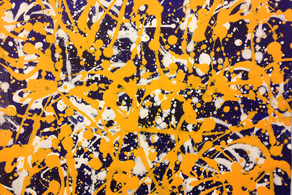
In recent years, the concept of “art” has been expanded to the point where many feel as though they can no longer question a work’s artistic quality. Doing so implies that they are unable to discern the meaningful message hidden behind what appears to be a pile of rubbish in the middle of the gallery floor. The question, however, isn’t so much whether a work counts as “art” but whether we have to agree that it is objectively “brilliant” or “beautiful.” Perhaps it’s time that the art world actually heed its own philosophy and accept that beauty truly is in the eye of the beholder. In other words, not everybody has to like it. A seeming lack of skill seems to be the tipping point for many modern art sceptics. A black square being hailed as a masterpiece seems to defy common sense, as does a shark in a box being worth two million dollars. At some point in your life you’ve probably flicked paint on some sort of canvas – the chosen method of the iconic Jackson Pollock. Modern art appears to be something you could have done, but didn’t; yet we seem to be expected to find it amazing regardless. In other words, an “us” and “them” mentality is fostered by the modern art community, in which the opinions of outsiders are dismissed as being the result of a lack of understanding. The Modernist art movement took off during the twentieth century, and encouraged artists to experiment with, and challenge, traditional forms and perceptions of art. Considered to be the most influential artwork of the time, Marcel Duchamp’s “Fountain” – essentially a urinal on a pedestal, signed “R. Mutt” – was a (rejected) submission to the prestigious Society of Independent Artists in 1917. So what makes Duchamp’s effort so influential? The answer is likely that it directly questions what it is that makes something “art.” Conceptual art has since taken off, and artists increasingly test how far they can stretch people’s perceptions and understanding of what the medium entails. There are countless stories of famous artworks being mistaken for junk. A Damien Hirst (the guy responsible for the two million dollar shark) once ended up in a charity shop. Last year, waste disposal experts threw out an Anish Kapoor. Clearly, these works do not scream “art” to all audiences. This raises an interesting question. If somebody looks at a piece of art and sees something not worth keeping, should we seek to “enlighten” them and sympathetically dismiss it as a misunderstanding? Or should we perhaps question our own opinion? Sure, it’s “art,” but perhaps the standard is rubbish. The basic philosophy underpinning much of the Modernist movement is that everything has some inherent beauty – you just have to look at it the right way in order to find it. Art, therefore, cannot be held to any objective standard. As a result, the question “what is art?” becomes unanswerable. However, it is at this point that the “art world” tends to slide towards hypocrisy. Highly influential French theorist Roland Barthes pointed out that the meaning of a text is determined as much by the reader as it is by the writer. This applies equally to an artwork. A viewer’s level of artistic exposure and their personal preferences contribute just as much as – if not more than – the art itself to the viewer’s overall enjoyment. Colin McCahon is an artist that I have consistently defended on the basis that his brilliance can only be truly appreciated by those with a contextual awareness of his background. A few days ago, however, I visited a dealer gallery in Wellington and found a McCahon sitting alone on a wall with a $65,000 price tag attached. I didn’t even recognise it as a McCahon at first – it was an unimpressive piece of tattered canvas sporting some black lines and a few words. $65,000 seemed ridiculous. As I explained to the gallery attendant why I particularly liked another work in the room, however, he responded by saying that, “oh, my favourite is definitely the McCahon.” I left wondering why. For the first time, I found myself not simply taking such a statement for granted. How, I wondered, does a simple name make an artwork unquestionably “brilliant”? No artist is consistent, and yet today it seems that a name alone can trump any question of quality. Part of me continues to believe that there are no objective standards when it comes to art; another thinks that the time and effort put in to producing a piece is deserving of some emphasis. Don’t hate on me for finding a square of red mind-blowing, because I certainly don’t hate on you for not. I might even sympathise, and agree how patronising it is that the “us” and “them” mentality assumes that some people simply “don’t understand.” Urban Dictionary defines an “art fag” as a “pretentious individual,” and I’m starting to whole-heartedly agree.
-
Culture
 Issue 21 01/09/2013
Gaga and the Art of Empty Pretention
Lady Gaga’s recent nudist escapades are currently the cause of a social media frenzy many of you will have witnessed in some form or another. In the video The Abramovic Method practiced by Lady Gaga, she exposes her body for a supposedly artistic cause: rising to Marina Abromovic’s extended performance art challenge. So many words could be dedicated to the varied and sometimes surprising reactions to this video. However, it seems more fitting to consider whether or not Gaga’s attempt to introduce art to the mainstream should be condemned or, like Jay Z’s, be forgiven – despite its lack of sincerity – due to the fact that it has prompted real discussion about the art itself. Musicians frequently collaborate with artists in order to visually express a concept. Thom Yorke worked with Stanley Donwood to create the distinctive Amok cover. Kanye West commissioned Takashi Murakami to work on the aesthetics for The Graduation. Alice Cooper and Salvador Dali – of all combinations – made a hologram together. And just think for a moment about Yoko Ono and John Lennon. However, it is art and pop in particular that have established a firm, immovable and undeniable relationship. Andy Warhol and his “celebration of celebrities” perhaps epitomises the fusion between art and mainstream pop. With the release of her album ARTPOP due this coming November, Lady Gaga claims to be starting a new art movement, akin to that driven by the infamous Warhol, in which “art drives pop and the artist is once again in control of the icon.” Pop art’s surge in the mid-twentieth century reflected the desire of artists such as Warhol and Lichtenstein to bring art down to the level of the everyday (hence the tin cans and Brillo) and away from elitist control. Gaga attempts the reverse: the appropriation of art by pop culture with the aim of highlighting the latter’s underlying social commentary (although her latest single “Applause” cannot possibly be labelled as anything but shallow, meaningless and boring). Is Gaga really the artist she claims to be? It isn’t clear exactly what her artistic goal actually is. On 11 November she will hold an exhibition, artRave, which will showcase collaborations between herself and artists such as Jeff Koons, Marina Abramovic and Robert Wilson. In “Applause” she pretentiously claims, “one second I’m a kunst [German for artist], then suddenly the kunst is me.” If there is any meaning in those lines, it is simultaneously obscure and yet superficial. Conveniently, Gaga argues that she doesn’t know where the ARTPOP journey will take her, and says that it “could mean anything.” Art seems to be simply a mechanism through which she hopes to achieve the shock factor. Both she and Abramovic have stated explicitly that what they are hoping to do with their joint video is attract attention – Gaga for her album and Abramovic for the newly founded Marina Abramovic Institute. Sadly, it seems as though Gaga’s recent embracing of art is merely a publicity stunt. However, like Jay Z, Gaga is indirectly confronting the social realities of our time, particularly social media and the role it plays in shaping cultural perspectives and values. Mimicking the rapper, Gaga will release a free app to complement the ARTPOP album later in September, designed to “make connections between music, art, fashion and technology.” Her use of social media is already having an effect: Abramovic’s Institute Kickstarter was able to reach its funding goal of US$600,000 directly because of the attention Gaga’s video brought to the cause. Should we criticise these musicians for their apparent lack of sincerity? Or, considering someone else will inevitably critique them for us, should we perhaps appreciate them for what they have, in their own way, managed to achieve? My general feeling is that Gaga is simply exploiting art as a means to her own selfish ends rather than genuinely seeking to create art for its own sake. The free app is simply a tool to strengthen her fan-base, to enable “little monsters” to share in their admiration of her, and, as she explained on Facebook, to allow her to experience “the adrenaline of fame.” Whereas Jay Z’s collaboration between performance and art was clear and effective, Gaga’s has taken it too far – and it’s messy. If she uses art in a more streamlined fashion to promote an idea reflected in her music, it might be more convincing. “Pop culture was in art, now, art’s in pop culture in me.” Mmmm, I beg to differ.
-
Culture
 Issue 20 18/08/2013
Ukiyo-e, The Floating World
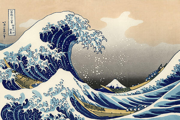
The woodblock print The Great Wave off Kanagawa by Katsushika Hokusai (1760-1849), which features rolling, white-tipped waves, has become a legendary emblem of Japanese art. Having been heavily appropriated by artists such as Manet, Gaugin and Van Gogh, the influence of the distinctive woodblock print style cannot be underestimated. The Great Wave off Kanagawa in particular is a forceful statement about the power of nature, and was most recently used in the context of the tsunami that tragically hit Japan in 2011. There are rip-offs everywhere: in one particularly amusing example, artistic duo Kozyndan sneakily turns the white tips of the waves into rabbits. Consequently, it was somewhat surprising to come across this very print framed in a collection in the Dunedin Public Art Gallery (DPAG). Ukiyo-e, The Floating World forms part of the DPAG’s “collection” of exhibitions entitled The Pleasure Principle, which covers the entire downstairs floor. Lining the walls of the largest room are woodblock prints gifted to the gallery by various donors, such as Dr Hocken and the family behind Olveston (that old house on the hill), who collected them in Japan during the immediate aftermath of World War II. Because prints were easier to transport than paintings the Gallery has a generous collection. This exhibition is therefore an artistic experience that could consume hours of your time. The exhibition devotes itself to explaining who donated each work rather than the context and concepts surrounding them, which is a little unfortunate. Ukiyo-e refers to a specific genre of woodblock print made in Japan between the 17th and 20th centuries that depicts landscapes and comment on aspects of Japanese life. “Ukiyo” is literally translated as “floating world,” referring to an atmosphere separate from mundane reality. The examples of such prints in the DPAG’s exhibition are satisfyingly disconcerting: neither completely mythical nor completely realistic. Dominating an entire wall is (most of) Hokusai’s Thirty-six Views of Mount Fuji. Each individual print features Mt Fuji, either as the brooding main subject or as a subtle background to a more dynamic focal scene. Although incomplete, this collection is absorbing. Hokusai was innovative in his exaggerated and yet realistic depiction of nature – particularly wind and water. He creates a strong, clear atmosphere in each print that leaves viewers with a sense of isolation. The faces of his figures – often labouring in rural landscapes – are rarely depicted, and this lends his works a slightly haunting feeling. The contortion and flattening of space contributes to the unsettling effect. Literal and highly intricate, the Japanese woodblock print has a potently distinctive style. However, this particular exhibition includes a wide variety of works that successfully showcase the range of individual styles within the genre. In comparison to those of Hokusai, Andō Hiroshige’s works are subtle and somehow more poetic – a less literal depiction of Japanese culture. His Asakusa-gawa-shubi-no-matsu imraya, which portrays a night scene, is one of the most stunning in this collection. The viewer is utterly immersed in the still darkness of night, yet all that is shown is a light blue sea tinged with navy blue and a deep sky scattered with stars. Presenting some of the finest examples of Japanese woodblock prints, this exhibition is well worth seeing – especially if you don’t consider yourself a fan of this particular style of art.
-
Culture
 Issue 19 11/08/2013
Jay Z: The Modern-Day Picasso
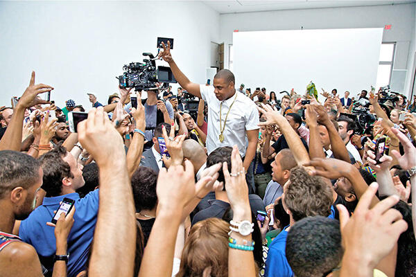
For six straight hours one Wednesday afternoon, Shaun “Jay Z” Carter performed the track “Picasso Baby” from his latest album Magna Carta Holy Grail in a New York art gallery. Although the ulterior motive was to shoot a music video for the song, the entire project completely transcends this idea. It’s brilliant. It’s effective. And it’s art. Titled “A Performance Art Film,” it is one of the most inspiring videos to have graced the likes of mainstream YouTube in a very long time. Check it out. Not only will you have a meaningful art and music experience, it will give you a bit more faith in humanity. People crowded against the walls of the pristinely white gallery space cheer as Jay Z walks into the room and onto the makeshift stage. He puts his finger to his lips in response. (Art galleries are renowned for their deathly silence after all.) However, the silence abruptly broken when the heavy bass beginning of “Picasso Baby” starts emanating from the speakers and the rapper himself asks, “can you turn it up a little more?” The concept of the work is inspired by Marina Abramovic – one of the most powerful performance artists of our time – and her 2010 work “The Artist is Present,” in which she spent 736 hours in MoMa engaging one-on-one with visitors. She now features in Jay Z’s own “installation”; foreheads touching and with a small smile on Abramovic’s lips, the two create a crazy, intimate dynamic. Pitchfork describes it as “amazing” – and it was. In fusing hip-hop and “pure” art it promotes a greater understanding and appreciation of both, which is exactly what Jay Z is trying to achieve. At the beginning of the video, he explains that his goal is to bring the two worlds – music and art – back together. Both art and hip-hop, he argues, involve an element of “performance,” an exchange of energy between the performer/ artist and the audience/ viewer. Jay Z reunites the two not only by performing in a gallery with other artists and interacting directly with the audience, but by filling his lyrics with references to art. Art Basel, Rothko, Jeff Koons, Christies, the MoMa – all are invoked in what simultaneously pays homage to the art world while questioning its pretentiousness. This has been a goal of Jay Z’s for a long time. In his earlier album Watch the Throne you find the lines: “graduated to the MoMA, and I did all of this without a diploma. Graduated from the corner, y’all can play me for a muthafuckin’ fool if you wanna.” Challenging the separation between art and music isn’t a new idea. Ai Weiwei and Anish Kappor have performed “Gangnam Style” and Yoko Ono has her own band. However, although these artists are infamous in the “art world,” they aren’t mainstream. Jay Z is. Many people find art intimidating, but Jay Z’s incredible fame and influence as a mainstream rapper makes the art he is working with instantly more accessible. In this music video you see every type of person possible. Some lucky young kids rap back and forth with the rapper’s arms around their shoulders. There are old men with beards. Every skin colour and every age group is represented, and every person watching Jay Z, whether from the edges or performing right there on stage with him, looks so incredibly alive. It is an amazing thing to watch. Skip to 2:30 minutes in the video; it is a particularly beautifully diverse moment. There is a commercial side to (almost) every story. The rap “king” negotiated a multi-million dollar deal with Samsung, whereby in exchange for their funding he would pre-release his album Holy Grail to Samsung users through an android app. You could see this as undermining the entire project’s authenticity by making it feel a little fake. However, give Jay Z the benefit of the doubt, and just appreciate the way he has exploited an opportunity to market music in a completely innovative way. So in conclusion, I respect Mr Shaun Carter. He may just be the “modern day Pablo,” as he so claims.
-
Culture
 Issue 18 04/08/2013
A Micronaut in the Wide World
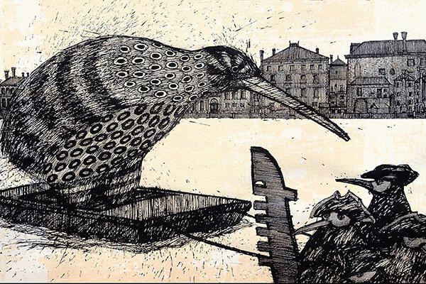
Hocken Library, 15 June – 10 August Exhibitions featuring an illustrator are few and far between. Depending on the number of bedtime stories you demanded as a kid, they can plunge you nostalgically back into childhood. Although he lived most of his adult life in London, Graham Percy was one of New Zealand’s most well-known and distinctive illustrators, having provided visual material for more than 100 children’s books. However, A Micronaut in the Wide World – currently showing at the Hocken Library – demonstrates that his ideas extend far beyond the realm of storybooks. Graham Percy was unknown to me upon entering the exhibition, but his illustrations were oddly familiar. They reminded me of Maurice Sendak: realistic enough to recognise what was being depicted yet with enough of a twist to be disconcerting. The human figures are out of proportion, their heads too large and their figures squashed in a way that makes you want to adjust them / push them into the correct mould. Percy’s style is highly memorable: his plump figures sit in beautifully detailed environments, often with scrawling text hanging in a top corner. Carefully constructed and quirky, they verge on graphic design. Bordering the two fields of art and design, illustration involves very specific representations of subject matter – much more so than the significant majority of recent “high art.” This level of focus allows illustrations to fit in with a body of text. Illustration has often been considered one of visual art’s “lesser” forms, but this attitude seems to be changing. In many of Percy’s drawings you notice a distinct awareness of artistic movements such as Bauhaus, possibly a result of his training at Elam School of Fine Arts. In 1994 he published a book called Arthouse, in which he designed each room of a house in the style of an artist he was influenced. (Joseph Cornell was lucky enough to be represented by the bathroom.) This exhibition gives viewers an overwhelming sense of Percy’s artistic and creative capability, and an insight into his ironic sense of humour. There are endless pictures of famous composers placed out of context, mostly in typical New Zealand landscapes. Franz Schubert emerges from a stream with a trout having found the inspiration for his “Trout Quintet,” and Beatrix Potter, her head an inflated balloon, is depicted casually observing some rabbits above the caption: “Beatrix Potter in her own special balloon watches rabbits dressed for occasion …” Interestingly, the most captivating part of the entire exhibition is not the works themselves but a 10-minute video of Percy’s house in London, created by the illustrator’s son after his death. Everything is immaculately laid out, each room bursting with art works and collections of objects. One object that stands out as a representation of Percy’s personality is his printer, on which painted black and white squiggles accompany the words “un homage à Wassily Kandinsky.” Percy died after catching pneumonia on a trip to get art supplies. He was creating and observing the world around him right until his death. With any large exhibition it becomes difficult to maintain the focus needed to really “look” at each drawing, but A Micronaut in the Wide World offers many gems that may touch your heart and possibly make you snort a little with laughter.
-
Culture
 Issue 17 28/07/2013
Café Art
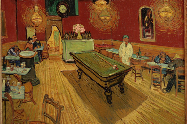
A friend of mine regularly teases me about being a “snob” when it comes to all things cultural. The best example of this snobbery I can give you is refusing to get coffee from the link – the aesthetics just don’t cut it. The counter-argument, however, is that having standards is not necessarily a negative thing. It can easily be argued that when it comes to art a line needs to be drawn between what is good and, well … average. Despite there being a grossly wide quality spectrum that varies from person to person, there are certain categories of art that most people could deem to be sub-standard – like café art. Café art usually falls well below the line, demonstrating that while anything can be called “art,” the label itself doesn’t mean it’s good. I will confess that a café or restaurant tends to instantly lose its appeal when I notice price tags next to whatever is framed on the walls. It is very rare that I find art exhibited in cafes anything other than gimmicky, tacky and exuding an air of desperation due to being painted by someone in a mid-life crisis. Typically using “kiwiana” ferns, beaches and Pohutukawa trees as subject matter, there is a distinctive style trending throughout café art that is generally amateurish – the artists may have technical capability but lack creativity. Often the works will be cheap imitations of those by prominent artists, such as the constant appropriation of Dick Frizzell’s Four Square logo works (which was itself an appropriation in the first place). If nothing else, café art frequently demonstrates the mastery found in an art gallery. However, there is always an exception to the rule. The stylish eyes of the people running Kiki Beware and Modaks admittedly prove my sweeping generalisation wrong. On their walls sit a few carefully selected works that tie in with each café’s distinctive atmosphere. For more contrast, a massive chalkboard at Mazagram – the boutique coffee roastery on Moray Place – features a different artist’s creative interpretation of the space each week. It’s a creative incorporation of art into the café, providing a non-profitable outlet for artistically-inclined locals to demonstrate what they can do. However, it seems rare for cafés to be this creative. Generally they create a sense of claustrophobia – the desire to make money overrides the desire to create a sense of exclusivity around the art and to give the viewer space to consider what it has to offer. It is necessary, of course, to acknowledge the advantages displaying art in café has for the artists themselves. Not many people venture into dealer galleries, so cafés allow art to be accessible to a more diverse audience. This can operate as a “kickstart” and, from a business perspective, is an easy way to generate a form of income. Furthermore, discussing the wall art can save an awkward conversation when on a coffee date. In spite of this, exhibiting art in a cafe is rarely successfully pulled off. Call me a snob, but I prefer to experience art as a devoted activity isolated from the potential distraction of drinking an average coffee.
-
Culture
 Issue 16 21/07/2013
Among the Machines
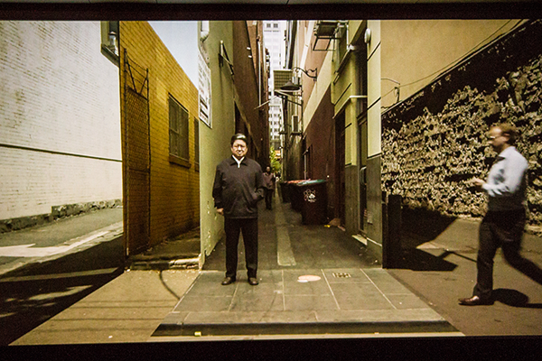
The use of technology has become a natural part of our lives. However, the idea of technology manipulating nature itself and becoming a controlling, dominating force tends to sit a little uncomfortably. Among the Machines is one of the Dunedin Public Art Gallery’s (DPAG) major exhibitions for 2013 and directly confronts this interrelationship between technology and nature – something that we have inevitably been affected by. The concept behind Among the Machines rests on the themes developed in Samuel Butler’s Erewhon, a classic dystopian novel in which, much to the concern of the human race, machines control evolution. This novel is intended to act as a “catalyst”; artists involved in the exhibition are encouraged to consider the relationship between machines and natural phenomena. The responses of the 13 New Zealand and Australian artists are diverse, ranging from a scan of the inside of a human skull to the creation of a utopian city on Mars. Either an artist’s subject matter presents a fusion of nature and technology or the medium itself reflects the idea – you often end up in a room staring at a screen. However, the exhibition does successfully generate different experiences within each darkened space. Some of the works did not seem to fit within the theme as well as others. For example, as beautiful as Fiona Pardington’s works are, her photographs in Erewhon: Left for Dead in the Field of Dreams failed to establish a sense of technological infiltration as successfully as Ronnie Van Hout’s. In contrast, the art that seemed to truly embody the theme were Hayden Fowler’s videos and the collaborative works by Hannah and Aaron Beehre, although they took the concept of a relationship between technological forces and nature in very different directions. Aptly chosen as the advertising work for the exhibition, Fowler’s New World Order manages to manipulate the voices of chickens in a poignant yet entertaining way. Shots of a cold, harsh grey forest slide in and out of the frame, sometimes including images of a unique looking chicken perched on a branch. The piercing mechanical throbbing that meets you when the bird starts to “speak” is startling – painfully loud yet also enthralling. It is in being such an unnatural experience that it becomes so entirely engrossing. Hannah and Aaron Beehre’s works were clever (although admittedly I tend to think this about most successful interactive art). Using small glowing orbs that react to the viewer’s movements in real time, he or she becomes part of the art itself. Without the audience, the artwork wouldn’t reach its fulfilment. However, the Beehre’s Toward Mt Terror represented the downfall of this exhibition in general. There was no indication that the glass doors barring us from what seemed like the obvious entry into the room were in fact an intentional part of the work. As art’s general mantra is “no touching,” a similar problem was encountered with Douglas Bagnall’s Cloud Shape Classifier – it didn’t occur to most people that the black buttons next to the screens of clouds were intended to be pushed. More guidance was definitely necessary. To enjoy this exhibition you need to dedicate a significant chunk of your time. Spanning almost the entire upper floor of the DPAG, the 24 works selected require you to travel through many different spaces and subject yourself to many different concepts. However, the DPAG does consistently impress me with its obvious desire to push art in an innovative direction. Running until 3 November, there is no excuse for missing out on this experience.
-
Culture
 Issue 15 14/07/2013
Art From a Laboratory
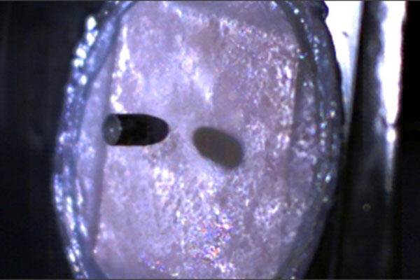
I don’t find a plastic crucifix immersed in a glass of urine offensive. However, the artist responsible for the Piss Christ received death threats for this sacrilegious work, indicating that some feel otherwise. Different individuals find different things “shocking,” but in spite of this it often feels like there’s not much controversial ground left for art to cover. Then again, what we find shocking in art are movements that manipulate the supposedly “untouchable” aspects of the society in which we are immersed – like biotechnology. I’m not sure how I feel about art that experiments with human skin. Firstly, it’s rather grotesque; and secondly, I am yet to figure out how I feel about the ethics behind it. In a project called 2.6g 329m/s, artist Jalila Essaïdi tries to create “bulletproof skin,” and videos a .22 calibre Long Rifle bullet being shot into human skin that has been implanted with spider silk produced by transgenic goats. She claims it embodies an attempt to explore “the social, political, ethical and cultural issues surrounding safety.” However, the concept of interfering with the structure of human skin for an artistic purpose was much more fascinating than that of “safety.” To what extent is society ready to accept manipulation of human biological matter for the sake of art? Science and art have never been mutually exclusive. Simply think about the role that optics plays in reducing scenes in our real lives onto a two-dimensional flat surface. Or Leonardo da Vinci and his plane models, for example. However, more recently the scientific method in particular has been incorporated into contemporary artwork, with the laboratory environment often used as a form of studio. The result is “Bio Art” – an international art movement that taps into genetic modification and cloning to produce distinctly … unusual works. “Bio Artists” contemplate the social and ethical values that have emerged in society as a result of biotechnological developments. Take the work of Brazilian artist Eduardo Kac, who commissioned scientists to inject a fertilized egg from an albino rabbit with a green fluorescent protein from a type of jellyfish. Called GFP Bunny, the finished “artwork” is a rabbit that glows green under a blue light. Far from being anti-science, many artists have clearly embraced biotechnology as a fresh way to produce works that exploit the biological matter we take for granted. Such works have the potential to make most of us quite uncomfortable. On the other hand, many artists feel a pressing need to use art as a forum for helping the public understand the issues surrounding the increasing role of biotechnology in our daily lives. The Critical Art Ensemble performed scientific procedures in public as a way of educating audiences about genetically modified food, with one project even involving the testing of participants. Interestingly, the FBI detained a founding member of the group on a (later disproven) accusation of bioterrorism. Biotechnology is, as you all know, a touchy issue, and has proven to be a particularly divisive debate in modern society – a society in which art is increasingly playing an outspoken role. So I do find the ability to make a real life glow-in-the-dark mammal “shocking”? I was certainly forced to think about the ethical implications of creating such an artwork. Many other “Bio Art” works push audiences in a similar way – they make us question the acceptability of scientifically manipulating organic material … while simultaneously grossing us out a bit.
-
Culture
 Issue 14 07/07/2013
A Broader Perspective
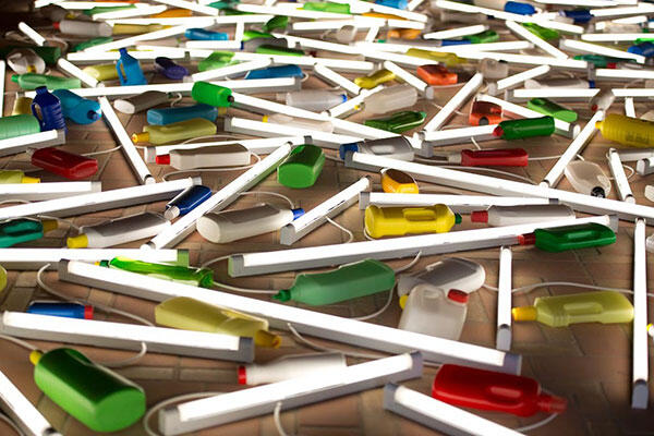
At the beginning of last year I was lucky enough to be taken to the United States by my parents, which involved traipsing around the Midwest and California for five weeks. Being avidly art-oriented, my mother has an incredible knack of finding galleries: take a very recent trip to the depths of the South Island, where we abandoned a lunch in Bluff for the sake of experiencing art in Gore of all places. So, no matter where we were in the big USA, I was exposed to art. The interesting thing was … it really wasn’t overly interesting. I reached a similar conclusion after travelling to Sydney recently. I’m ashamed to admit it but upon leaving New Zealand I always have great expectations of experiencing the bigger, better and brighter world, under the belief that we are missing out. I always return loaded with guilt that I had such little faith. A couple of weeks after coming back from the States I had two similarly arty friends come and stay with me in Auckland. For a few days, in a somewhat nerdy pursuit, we drove around the city from one dealer gallery to another, immersing ourselves in the art. What I saw in that short space of time was infinitely more memorable than anything I saw overseas. This led me to patriotically see New Zealand artists as truly at the forefront of artistic creativity on the international scale. New Zealand’s size constrains the ability of our artists to achieve success without extending their focus to the global arena, with international recognition essential for an artist survive economically. Also, like seemingly every other facet of our lives, art has become globalised. For example, La Biennale de Venezia is the type of international art event that bloggers go crazy over. Considered by many to be the most prestigious celebration of the visual arts in the world, Creative New Zealand invested $650,000 this year into a pavilion intended to promote Kiwi art, culture and innovation. Known as the “master of light,” a reference to his trademark works created out of fluorescent lightbulbs and milk bottles, Bill Culbert was selected this time around to fill New Zealand’s space, creating eight installations within the old, antiquated walls of the beautiful city of Venice. One is a chandelier constructed from chairs and beaming poles of lights suspended from the roof of a corridor in which Vivaldi once upon a time taught violin. Met with glowing reviews from newspapers such as the UK’s Sunday Times, which named New Zealand’s pavilion as their favourite, and with the average number of visitors to Culbert’s work per day already at 1,417, New Zealand art is making its mark. While this week’s piece is not exactly about art within local Dunedin, or the country for that matter, sometimes there is value in considering the biggest picture of all – the importance of New Zealand art’s place in the international arena. The world is taking notice, so add it to your list of reasons for being proud to belong to this fine land – other than having a decent rugby team and a lot of sheep.


