
Charlotte Doyle
Art Editor 2013
Articles by Charlotte Doyle
17 articles found. Displaying page 2 of 2.
-
Culture
 Issue 13 26/05/2013
The Material World: Sculpture at Dunedin School of Art 2002-2013
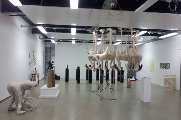
This week I’ve made a rather awkward mistake. Failing to think about the fact that exhibitions have a finishing point, I arrived at the Dunedin School of Art gallery on the morning of 17 May planning to write a phenomenal review of their contemporary sculpture exhibition. Then I realised it ends on 24 May, before this article will even be published. However, choosing to stubbornly stick with Plan A, there is a lot to be said about an exhibition that transcends its written critique to the point that people will be inspired to experience some art themselves. The School of Art should have more prominence in the student community. After going to the Dunedin Public Art Gallery, seeing the contemporary sculpture exhibition there, and making comparisons, the students coming out the other end of the Polytechnic have a lot to offer. Unfortunately, trying to actually find the Art School is a bit of an endeavour due to its weird location. But make the effort and get amongst Dunedin’s local creative scene. The Material World: Sculpture at Dunedin School of Art 2002-2013 exhibited works crafted by alumni in honour of two sculpture teachers who have taught at the school for 10 years. Admittedly, there was the occasional photograph, graphite drawing and video, but sculpture was the dominant medium. With such limited space and so many contributors, the gallery was inevitably too cramped, making it impossible to focus on one work at a time. Gazing at Victoria Bell’s beautifully executed sculpture of elegant flamingos hanging butchered from the ceiling, one was distracted by a not nearly as impressive video of someone taping their head to the floor in one’s peripheral vision. By the time I worked my way around half the room, I’d almost had enough, and it wasn’t until I was walking out the door that I noticed works in the corners that probably had not been given the prominence they deserved. But all this aside, there were some exceptional works of art. So often contemporary sculptures fail to be “new” by trying too hard to be so. While I wasn’t impressed with all of them (somehow, I feel we can move past some bricks on a concrete floor), for once, it didn’t feel like I’d seen all of the sculptures before. Take the bright yellow well on very green and very fake Astroturf in the middle of the room. Completely constructed out of bars of soap, it commanded attention. Then there was the spiked punching bag hanging behind it. As contemporary artworks, they moved beyond simply addressing the everyday – a norm that has pervaded art for long enough. It’s time to move on. Showing more prominent artists, the Dunedin Public Gallery also had a contemporary sculpture exhibition: Shape-shifters. Leaning against a wall is a Michael Parekowhai, and there was obviously more attention, care and (from a practical point of view) scope for curatorial finesse. Unlike at the School of Art, each work is meticulously placed in its own defined space, making it dramatically less overwhelming and claustrophobic, which makes a difference. However, while some of these works were captivating (like Daniel von Sturmer’s “Screen Test: Sequence 1” where sponges and rolls of toilet paper shoot across perpendicular screens) the students’ works made me think more – I couldn’t just assume they were about the shape of the object and its relation to the space around it. “I am for an art that takes its form from the lines of life itself, that twists and extends and accumulates and spits and drips, and is heavy and coarse and blunt and sweet and stupid as life itself …” – a quote by Claes Oldenburg plastered on the wall of the DPAG, but it seems more appropriate for the works at the Polytechnic. Watch their space.
-
Culture
 Issue 12 19/05/2013
Patrick Hartigan - The People Will Be Healed
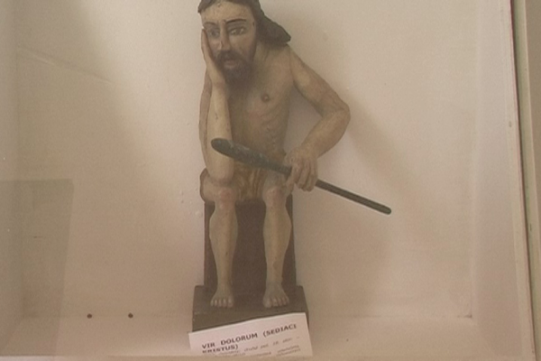
Standing at one end of the art gallery, we were completely entranced by a large guy in a grey fur coat, with basketball sneakers along the bottom. His mannerisms and laugh, even from a distance, were like those of a stereotypical Jewish banker. Coming close enough to listen to him, he also had some solid good-natured swearing, describing how he “started doing rap lyrics in a Maori accent” when trying to seduce a girl in an attempt to “blend our fantasy worlds so we could see into the future.” That is the nature of exhibition openings at Brett McDowell Gallery – always bursting with eclectic caricatures come to life with the guarantee of a memorable conversation. This week was no exception. Every couple of Fridays at 5.30pm, Brett McDowell (a dealer gallery located opposite Les Mills) has an exhibition opening involving drinks laid out in rows on a big wooden table and the most interesting people in Dunedin. My favourite gallery space in this city, I go partly for the gaping holes in the old wooden floorboards, which Billy Apple loved so much he even made some art about them. I trust Brett McDowell’s taste. There hasn’t been an exhibition yet where I don’t understand why the artworks or the artist caught his eye, even if there isn’t much I like about them. He has a talent for recognising artists with a unique quality to which people should be exposed, and Hartigan’s slightly depressing and confusing work was no exception. Sign up to the mailing list, if not for the kick of getting such a fancy-looking letter in the mail and telling your flatmates it’s an invitation to an exhibition opening, then at least to be part of such an interesting crowd in such a beautiful space. This week, the exhibition was slightly different. I’m used to openings at Brett McDowell where you wander from wall to wall through groups of people mingling and discussing each other, occasionally glancing at the art itself. Thus, it was unusual to find only a looped video playing on a medium-sized TV in the middle of the room with the eccentric, fun people clustered in the corners. Patrick Hartigan’s filmed work, The People Will Be Healed, had, very deliberately, been made the stubborn, sole focus of the room. Five modestly-sized portraits had been hung around the corner, distinctly separate from Hartigan’s exhibition. However, these abstract and unusual paintings’ presence put the artists’ style in perspective. Awkward and slightly macabre, they tie in with the hallowed religious Slovakian folk sculptures that feature in the video. Originally made for display in homes and small churches, Hartigan successfully demonstrates how our appreciation of these sculptures is thwarted and controlled by that which the world thinks can be “upgraded” to “art.” One screen shot taken inside the museum gave a red fire extinguisher as much attention as the glass cabinet containing it. Not only does Hartigan focus on the pieces within the museum, he shows us images of the mundane town (complete with tanned, tacky tourists) in which they are situated, forcing one to consider of the environment these sculptures inhabit, and how they have come to be there. The sculptures are beautiful, solemn, contemplative figures, which were intended to be viewed in a comforting, normal environment. Instead, as Hartigan states, they “lie forgotten by the museums entrusted with owning them,” as the museum is unable to afford to hire an attendant. We see the grime on the front of the glass cabinets, and Hartigan compares the impression made on him by the exhibition to the sight of his father dying from cancer a few weeks later. A morose piece, Hartigan seemed desperate to emphasise how aspects of our lives make transitions into “dying” states.
-
Culture
 Issue 11 12/05/2013
Saskia Leek’s Desk Collection
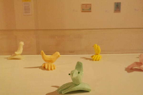
Saskia Leek’s solo exhibition Desk Collection at the Dunedin Public Art Gallery is a true testament to her evolution as an artist. Seeming to almost celebrate Leek’s personal journey as an artist, the exhibition didn’t just present this to the viewer, but swept them along for the ride through an extremely effective installation of her work. Leek’s paintings are not outrageous, controversial or aesthetically draw-dropping, but there is a serene surrealism to her small, intimate works that leaves a lasting impression. The title Desk Collection refers to Leek’s having created every painting at a desk, alluding to the exhibition’s “timeline” structure and putting the paintings’ size into perspective – they are unobtrusively small. Paintings of this scale run the risk of being swamped with expanses of white wall, but any sense of intimidation was offset by the installation itself: the paintings were placed at eye level on partitioning walls creating intimate, enclosed spaces, much like those depicted in the works themselves. As a result, the paintings and works of other media (a sculptured caravan and cabinet of beautiful soap sculptures) tie together seamlessly. The layout of this exhibition was exceptional, guiding the visitor in the right direction, but giving them the freedom to form their own interpretations. Combining quotes from the artist herself with considered observations, the writing on the accompanying placards avoided convolution. The installation enhanced the beauty of the paintings, something that many galleries often, bafflingly, fail to do. Recently shortlisted for the prestigious Walters Art Award, Saskia Leek has a prominent presence in the New Zealand art scene. Admittedly, her works initially failed to grab me. However, suffused with intimacy and unimposing in their scale, these paintings are designed to affect the viewer gradually. If one were simply to flick from one painting to another, their subtle grittiness would go unnoticed. A reasonable amount of time is required to discern these paintings’ beauty, and understand why Leek deserves the title of “success story” to which this exhibition pays homage. The opening wall describes Leek’s works as a shift “from junk shop to old master.” While there is a noticeable change in her style and painting formula (with a somewhat side-tracked venture into abstraction), underlying the whole exhibition is an otherworldly and slightly dark tenor. It begins with Leek’s earlier popular culture-oriented works that elevated her to prominence as part of a group exhibition Hangover in 1995. These works present a critique on contemporary culture that references the artist’s own teenage experiences and the American iconography she was influenced by, exemplified by a self-portrait of Leek as Sandra Dee. With strong colours, witty commentary and bold figures, these works reflect the extent to which the artist’s painting style has developed. Leek settles into a thoughtful and genuine style, with most of her paintings containing relatable subject matter like horses, houses, cats and fruit. However, the success of her works is their edgy, surrealist nature embodied in the environments in which she places these objects. The penultimate painting depicts a gathering of Victorian figures, seemingly lost in deep, green bush. Vaguely sinister, you wonder why they are there, why some figures are distorted, and just how that one little man ended up in a clearing all by himself? From a technical point of view, the works are deceptive. Seemingly simple, there is a lot the paintings provide the viewer beyond the first glance, offering the viewer not just a scene, but a story.
-
CultureIssue 10 05/05/2013
Facebook cover photos
Coverslike.com provides internet users with endless freedom to “customise your Facebook timeline cover” (just in case no photos of you and your friends seem pretty enough). For serious pug lovers you can have one which states “the day God made Pugs He just sat down and Smiled” next to a pug puppy with its nose in a daisy. There seem to be no limits to the extent of originality with this particular Facebook feature. While most cover photos are not “art” (as much as you try to stretch the definition of the word), there is an art to your choice and the consequences of the impression you leave with those stalking your page. It is a daily, potentially very personal, creative outlet with much to answer for. Different people devote their cover photos different amounts of attention and care. For many it’s simply a nice, fun or cute picture to fill the gap. For others there are many more considerations. Does the cover photo colour scheme tie in with your display picture? What does your cover photo say about you? Is it too radical/outrageous/politically active? The cover photo hasn’t been around long; however, it has become an ingrained part of our online experience and for many it is a novel phenomenon. It provides an opportunity for people to think about themselves from a creative perspective when they might not have done so before. Cover photos are rated by their viewers. Mashable.com recently uploaded a slideshow of the “Ten most engaging cover photos” including that from the page of Mitt Romney. People are judged on how aesthetically pleasing their choice of photo is. There is an opportunity for artists and other prolific figures to exploit this space to a further extent. It also provides the potential for an exhibition space where people can display their own photography or art. As an outlet for individual expression, there is a lot a cover photo can say about someone. Cover photos are mood focused, often changed to fit how a person is feeling even if done subconsciously. Last year, often out of sheer boredom, my cover photo would erratically change multiple times a week – enough for friends to comment. It would range from a close up of Azealia Banks’s face to a stunning photo of intensely blue waves. In this way cover photos are a record, keeping track of how you felt at a particular time and the reasons behind the choice of that particular photo. There are endless websites providing suggestions on the perfect photo. Embedded in the internet is an infinite world of cover photos to choose from for those struggling to fill this creative outlet with their own intuition. However it can be artistic in being used as an opportunity to advertise or expand your creative capability. Simply uploading a scenic picture of some gorgeous place you’ve travelled to is heading in the right direction.
-
Culture
 Issue 7 14/04/2013
Badd Energy - Underwater Pyramids
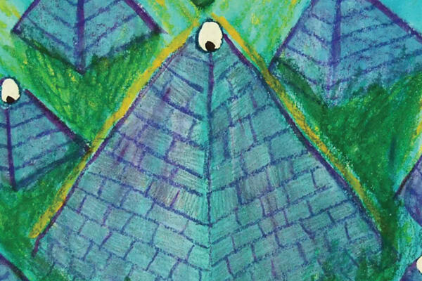
When writing a review, it can be extremely difficult to take an objective, non-partisan perspective and put my own personal taste to one side. Especially with the album Underwater Pyramids by Badd Energy, as it is a style of music that sits at the lower end of my music-enjoyment spectrum. Initially I wrote it off as pretentious, noisy, and badly produced. They thank “whanau, whamily and whiends”, and I do judge albums by their covers. However, I will admit that by ignoring these instinctual feelings and employing a little more critical thought, exploring this album proved interesting. For original band members Samuel Moore, Coco Solid, and Trixie Darko, this is their second album with Flying Nun records. Underwater Pyramids feels very underground, with a bare structure and noticeable psychedelic influences giving it a distinctly punk feel. The band describes itself as “stoner-swamp”. Presuming my assumptions about what “stoner-swamp” is are correct (I remain oblivious to the phrase’s exact meaning), listening to the album with this description in mind you do notice the heavier drop-beat qualities and darker vibe created by the drum machines. A distinctly minor key flavour provides a basis for their interesting incorporation of 808 rap, though they tend to sit atop the instrumentals a little uncomfortably – at one point I equated Trixie Darko’s vocals to the wonderful M.I.A. Recorded in Samuel Moore’s house in Auckland, it was difficult for me to get past the presence of blatantly unintentional fuzzy elements in songs that a professional producer would have smoothed out. The album was also a little eclectic. Greater continuity of the “messages” would have worked in its favour. “Riot” invokes the anti-establishment messages typical of underground bands, but it seems to be the only song on the album that does so. However, I was impressed by Badd Energy’s activist efforts within our local community, using gigs to raise awareness about issues such as gay rights. Although there were touches of something unique in songs such as “How Do You Sleep,” overall I found the album unsatisfying. There’s an obvious intention to produce something a bit different, but greater cohesion and development of their music style would have helped to create a more solid album. Still, a label has taken notice, with Underwater Pyramids released not only here but also across the ditch – so Badd Energy have definite potential.


